My offers
Creating a single, personalized home for all guest promotions
At United, we offered a wide range of promotions — from check-in coupons to MileagePlus offers to MilePlay games. But there was no single place for users to find them. They were scattered across shopping flows, checkout modals, and emails — which meant users often missed them entirely. I led the design of a one stop shop for all your personalized offers and highlighted top featured offers on the home page of the United app.
Context & Goals
The business team came to us with background research and feedback from MileagePlus members about how United’s rewards and offers were surfaced. The insight? We were leaving revenue on the table.
Offers were scattered — sometimes they showed up on trip details, sometimes in emails or seasonal marketing campaigns. But there was no single place for users to save them or revisit them later.
This lack of visibility led to low engagement, forgotten rewards, and missed opportunities to drive loyalty.
Our goals :
Create a reliable, centralized place for users to discover and track their personalized offers
Boost coupon redemption by making them easier to find and use
Increase engagement with Mileplay by giving it more visibility
Drive more MileagePlus signups by highlighting exclusive member-only offers
My Role
I was the senior UX designer solely leading the design for this initiative. I worked closely with the marketing and loyalty teams to align on business needs, technical constraints, and user expectations.
Discovery & Problem Framing
We began by auditing every offer surface across the app, marketing flows, and emails. It was clear: no two offers were surfaced the same way, and there was no mental model for where to find them.
The research team had interviewed MileagePlus members and frequent flyers to understand how (and if) they engaged with offers. We heard the same things:
Research participant
“I just search my email for offers”
Research participant
“I only book with United and I don’t even know what Mileplay is”
We also did a competitive analysis of how different industries were displaying multiple offers in a specific location on their apps and found that most shopping applications had a version of ‘my offers’. Looking at best practices across these apps, the business team defined certain requirements for the feature:
Categories for different types of offers
Instructions for how to redeem
Ranking offers by relevance
HOW MIGHT WE
create a centralized experience for personalized offers that’s easy to find, easy to use, and drives more engagement across our loyalty program?
Ideation & Usability testing
With our requirements in mind, I created different low fidelity design concepts that we wanted to usability test.
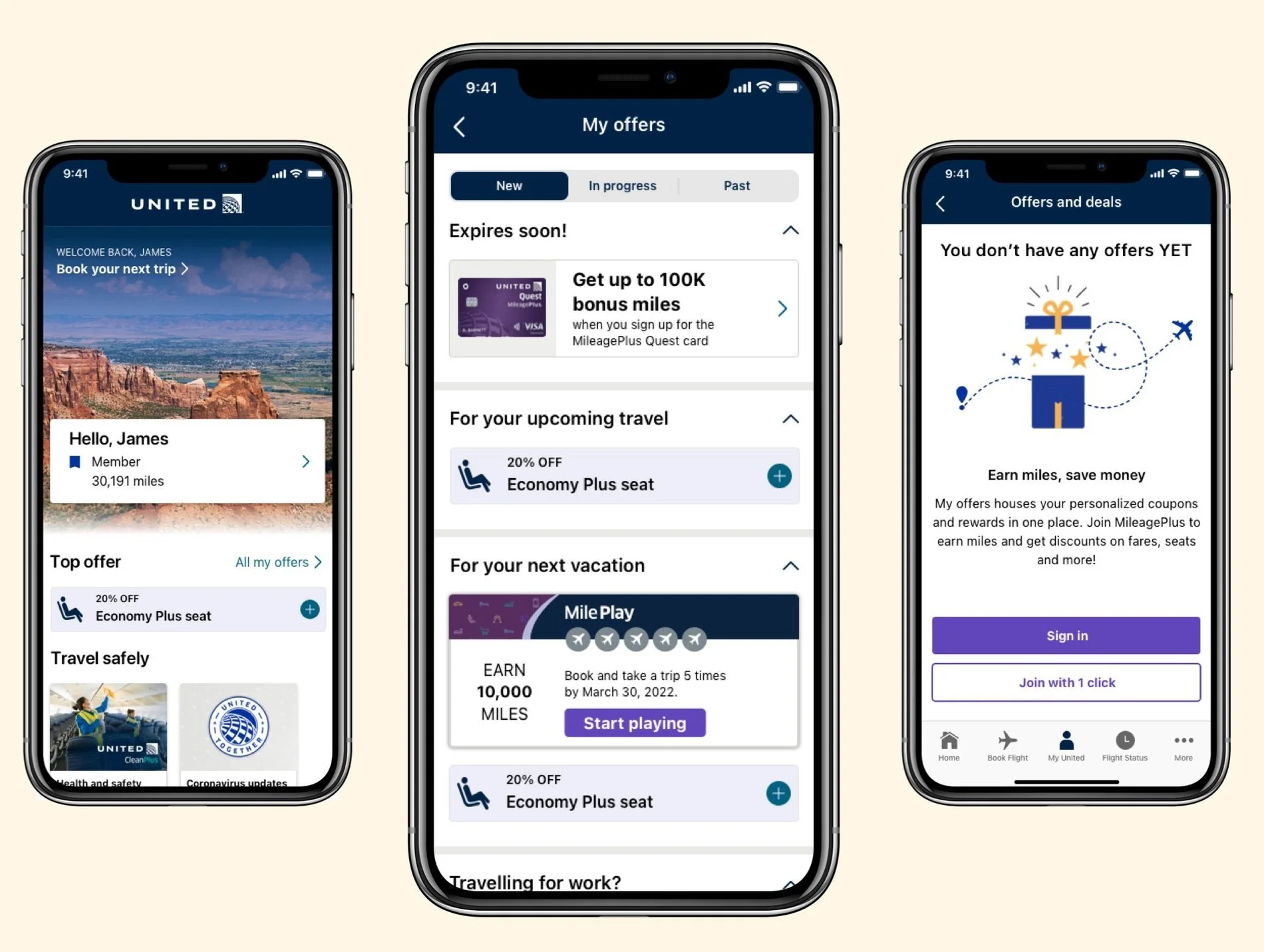
Design A was focused on separating the offers by ‘new’, ‘in progress’ and ‘past’. This kept the focus on new coupons and offers for the guest.
Design B was focused on separating the offers by ‘Top offers’, ‘coupons’ and ‘rewards’. This kept the offers categorized in the different types.
Design C kept all of the offers on one page with no tabs. This kept the user on one screen where they wouldn’t have to worry about toggling back and forth.
We wanted to be able to see what layout worked best for the users, what information they were expecting to see in each section.
I created the prototypes for each design and worked with our user researcher to set up the test. We set up a counterbalance test and our user researcher performed a moderated usability test.
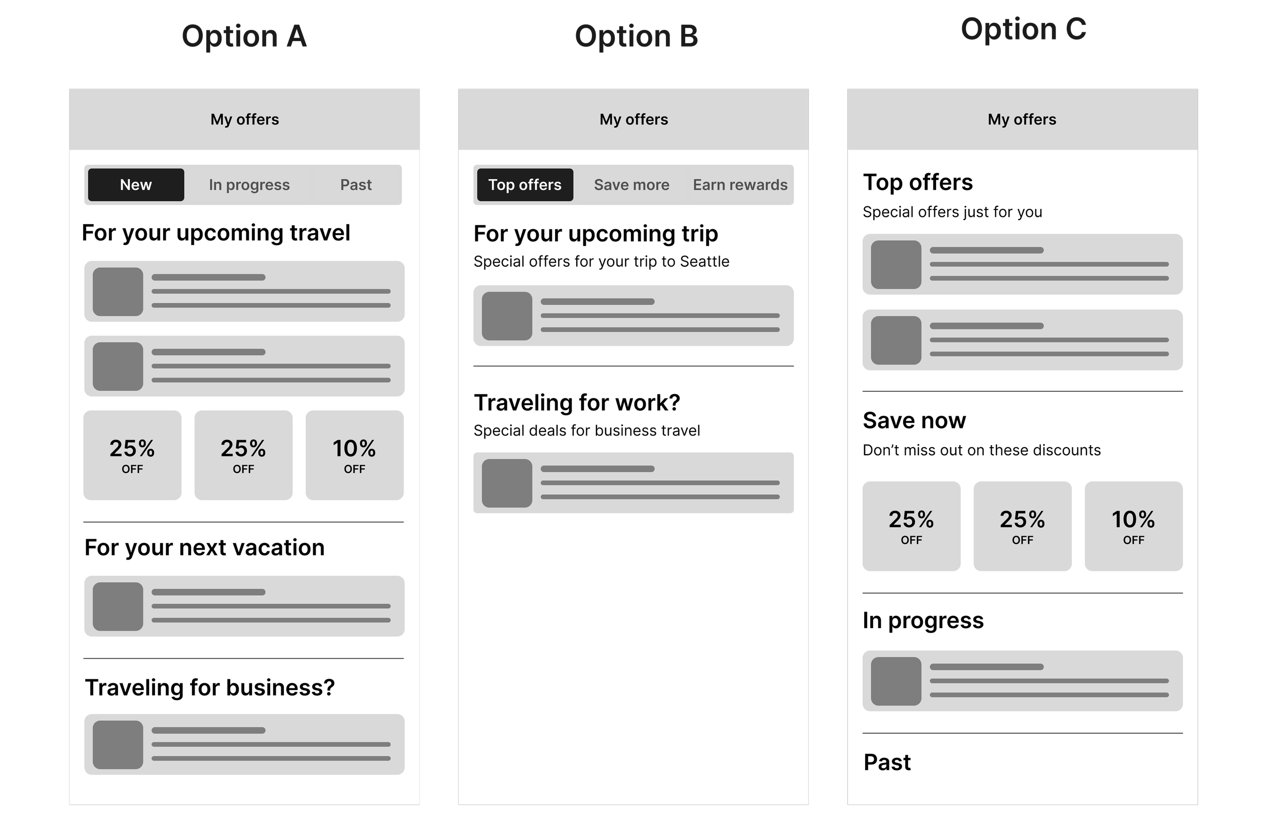
Winner: Design A. This came as a surprise to me as I was leaning more towards Design C as it kept everything on one page. But this goes to show why we do usability tests! The users found it the clearest and easiest to use and liked the focus on what was new.
Final designs
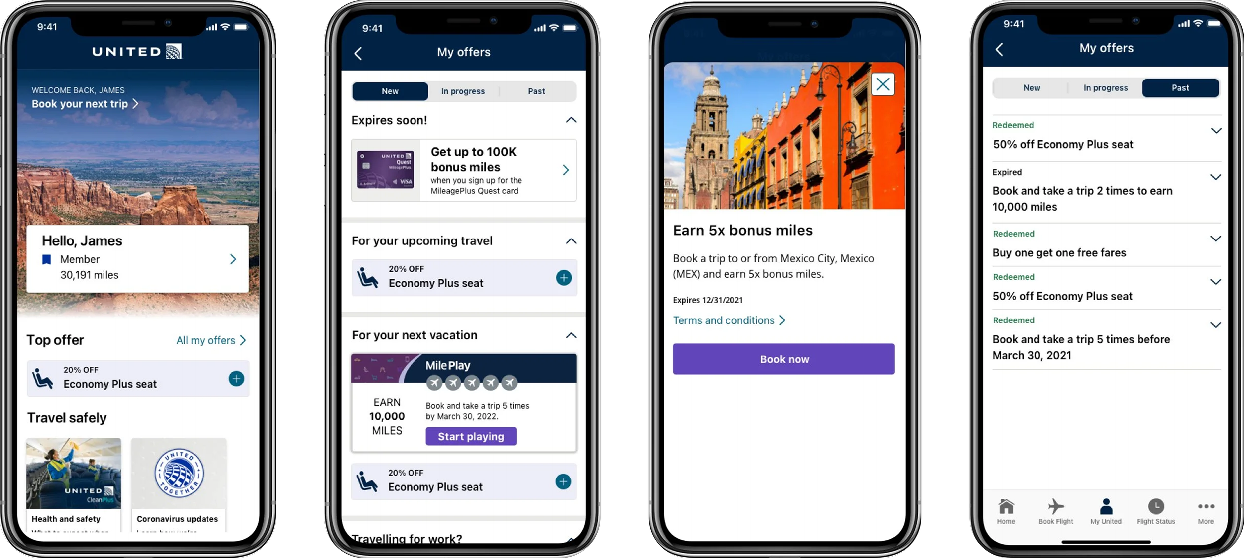
Member designs
Now that the structure was finalized, it was time to work on high fidelity designs. We wanted to be able to have different designs for coupons versus rewards so that users would easily be able to tell them apart.
Coupons would be able to be added to the users shopping cart so the discount would be applied automatically.
Rewards would require actions in order to redeem the rewards.
From the testing, we saw that users wanted to have a color differentiation for the coupons and because the United brand does not want to feel ‘discounty’, we made the discount number smaller.
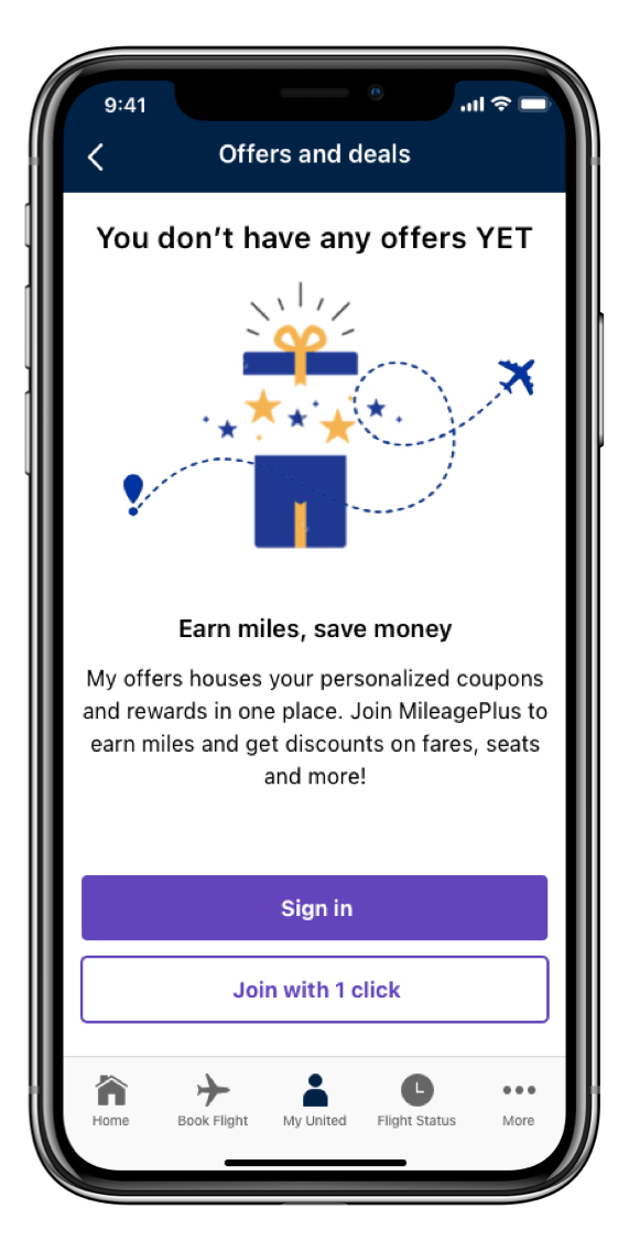
Non-Member designs
The other scenario that I needed to design for was non-members. Non-members would still be able to access ‘My Offers’ but they wouldn’t have any offers because they would either need to sign in or sign up. I wanted to encourage those non-members to sign up and because United recently enabled one click enrollment, I thought it would work great here to incentivize users.
Results & Reflection
The feature launched after I transitioned off the team — but it lives on as “My Offers” on the United app today, a dedicated place where guests can find all their current, active promotions.
While I didn’t stay to see metrics, it was exciting to see the design vision through and shape a foundational part of United’s guest loyalty experience.