Bark
Creating an app onboarding experience for a smart dog collar
Bark is an application that supports a smart dog collar. It needs a proper onboarding experience so that users will be able to set up their pups with ease!
Background: UX Design Hackathon Finalist
Roles: UX research, UX/UI design
Tools: Figma
Timeline: ~48 hours
THE CHALLENGE
Create an onboarding experience for a smart dog collar app and create a video to present research and UX/UI designs
RESEARCH & DEFINE


User interview
Competitive Analysis
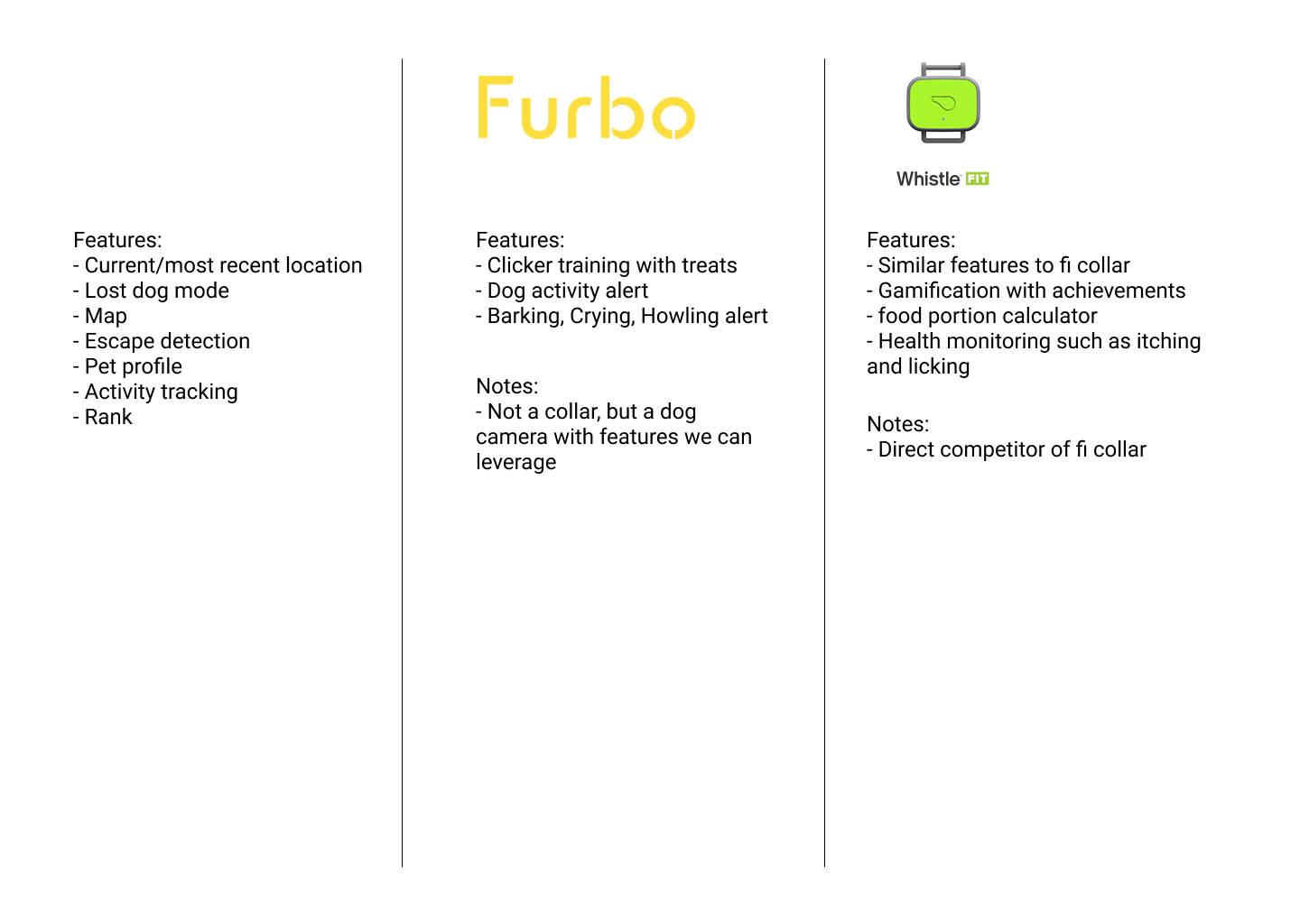
With less than 48 hours to do research and design, we decided to focus on research and defining the users on day 1 and designing on day 2. For our initial research, we performed a competitive analysis of all the other smart dog collars in the market currently and mapped out the features that they included. This gave us an idea of the features that we wanted to include in our app so that we could focus on getting those features set up when a user was onboarding.
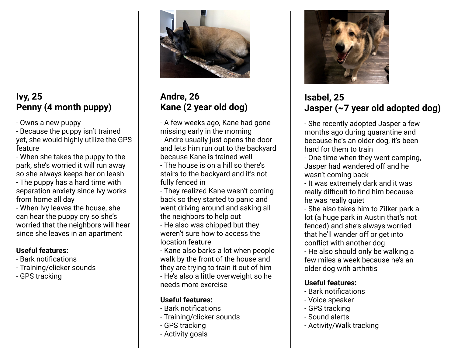
For our next bout of research, we performed user interviews on some dog owners that we knew. They talked about stories about training their dogs, stories where their dogs had run off, and features that they thought would be useful in a smart dog collar. This gave us real life scenarios of potential users and what we could do to help. From the competitive analysis and the user interviews, we wanted to focus on:
Getting the dog’s information
Training
Location
DESIGN & IDEATE
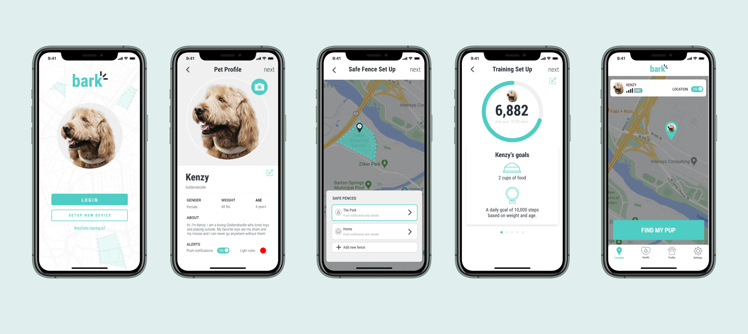
With a focus on these features, we narrowed our users to new dog owners who were technology proficient as they would want to use this collar to the most of its ability. On day 2, we then mapped out a low fidelity mockup of the user flow. The user would be opening the app for the first time and need to pair the collar with the application. Once paired, the basic information of the dog would be captured and then the users would then set up the ‘safe fence’ feature and set up the training features of the collar.
We were also asked to create the home page of the application once the user was done onboarding, so we also had to ideate on what to include in the navigation bar. We decided to include location, health, profile, and settings because like our competitors we had similar functionality. From there, we brought our designs into high fidelity and created a prototype to present to the judges.
THE PROTOTYPE
REFLECTION & NEXT STEPS
We were able to be finalists and had an honorable mention as the ‘Crowd Favorite’ for our project! If this project was to be created, I would want to follow up with some usability testing for this onboarding flow. From my perspective, I believe we could’ve narrowed down on our focus and simplified our onboarding flow. Getting users to onboard can be overwhelming and we did not give the users the ability to skip certain steps. There is a possibility that users could drop off and not complete set up and we’d be able to determine where they would drop off and how often if we were able to do some user testing. That data would allow us to narrow down our scope and focus on maybe 1 feature to set up and allow the users to set up the rest of the information once they are done with onboarding. Overall, I really enjoyed this quick competition as it gave me an experience to fit the design process into 2 days!