Food Forward
A non-profit organization working to provide hunger relief and promote food sustainability
Food Forward is a non-profit organization working in the fight against hunger. They haven’t updated their website in years and needed to bring on a UX designer to create wireframes for their new site.
Background: Volunteer Project through Catchafire
Team: Technology Manager, Developer
Tools: Figma
Time frame: ~8 weeks
THE CHALLENGE
Create low to mid fidelity wire frames for key template pages in the new Food Forward website.
PRIOR WORK
Before beginning the project, I hopped on a call with the project manager to discuss the goals of the company and the work that was already completed. Their team had been hiring volunteers to perform tree testing and user interviews, create a brand guideline, and perform a website audit of their current website and they needed me to finalize the new site map and create mid fidelity wire frames to pass off to their in-house graphic designer and their developers.
Primary Website Goals
Raise money & cultivate donor base
Raise brand awareness
Newsletter Sign-Ups
Secondary Website Goals
Volunteer Sign-Ups
Food Donations
RESEARCH

Tree Testing/User Interviews

Personas
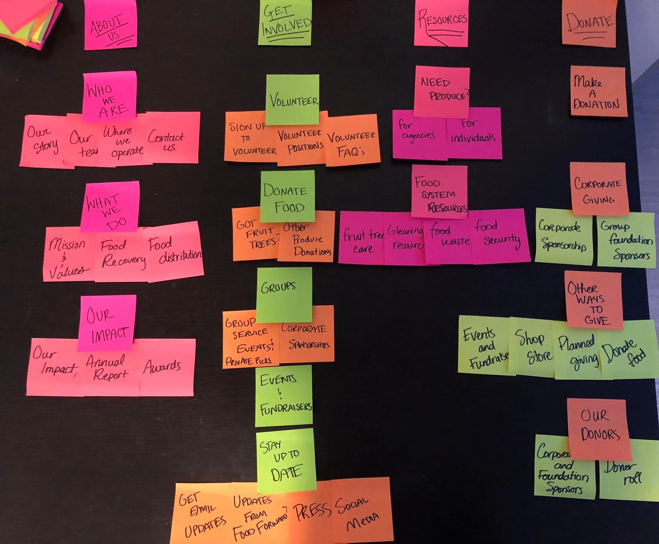
Prior to coming on to the project, the team at Food Forward had already performed tree testing on their users. They began by asking the users basic questions like “What do you do on the Food Forward website?” to gain an understanding of what the users were doing. They then asked the users where they would find certain information on the website and took note of where the users were going. Although I wasn’t able to observe the tree testing, I was provided with the results and notes taken from each test. I compiled the notes and wrote out each page of the website on sticky notes so that I could visualize their current site map in order to make some changes.
The Problem: Users are struggling to find essential items on the current website.
DEFINING THE USEr
Who is our target audience?
The team had compiled a large list of their target audience and all of the people who were coming to their website and why. Because it was an extremely large list and some of the personas were very similar, I worked with the manager to narrow down the list of the personas to the key 6 personas that were accessing their website. We discussed each persona’s backgrounds, goals and pain points of the site and how it could contribute to the overall goals of the company.

With a strong understanding of our target audience, and the results and research from the tree testing, I began putting together a sitemap on a shared Figma board so that the project manager and I would be able to collaborate easily. I did perform a light competitive analysis and did some research on other food sustainability non-profits to see how other companies had organized their navigation. Because the primary goal of the website was to generate more donations, I wanted to include a donation button in the main navigation so that users would be able to easily access the donation form. We also finalized the main navigation titles so that it would be more clear for the users to move around the website and easily find the pages that they were needing.

Using this finalized sitemap, we began to list out key template pages for the website that needed to be created. Because this was being created on Wordpress, the Food Forward team only needed general templates of the main pages of the site. We decided that we needed to create the following pages, and I began to sketch some ideas out on paper.
Home Page
Landing Page
Main Page
Sub-main page
Content Page
CREATING THE WIREFRAMES
Because the Food Forward team wanted to be able to have the developers start creating the new site as soon as possible, I had a much shorter timeline so I had gone straight to creating mid fidelity wire frames on Figma. I used the same art board that we had used to create the site-map so that the project manager and their team were able to see the frames and comment on anything that they needed so that I could ensure a faster delivery.
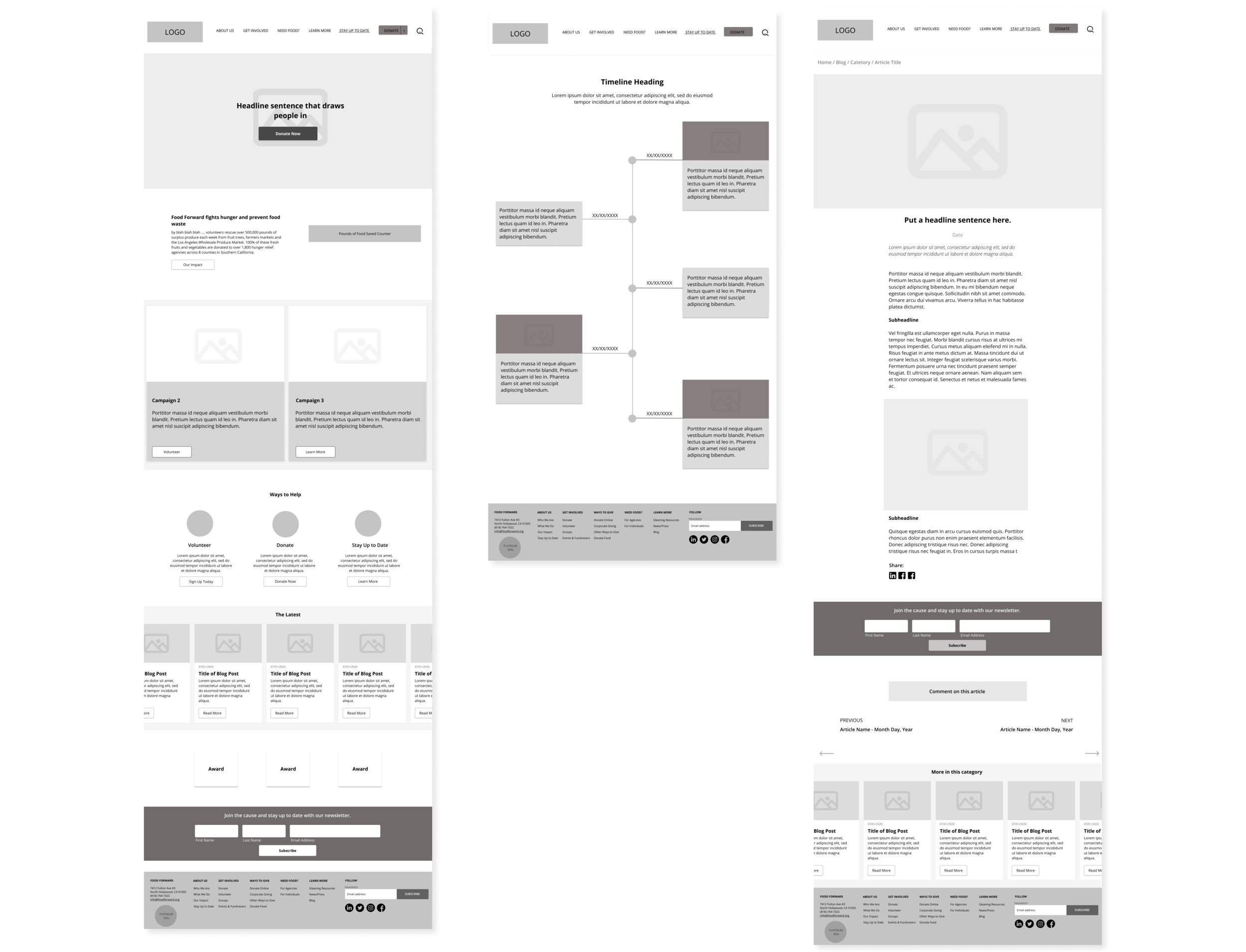
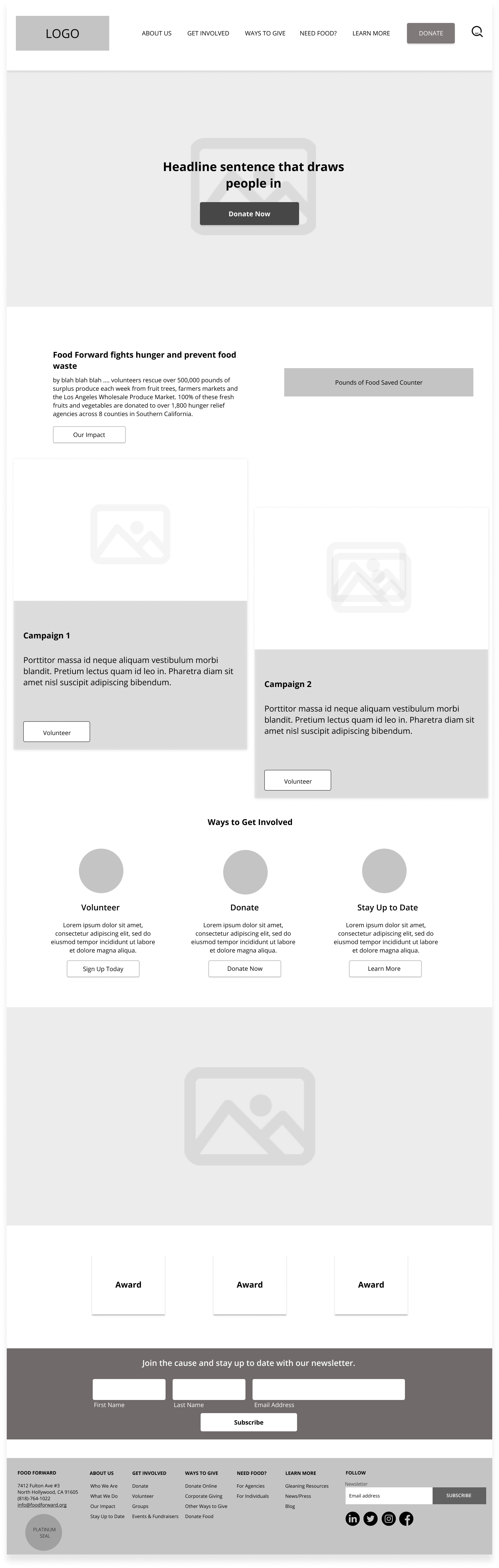
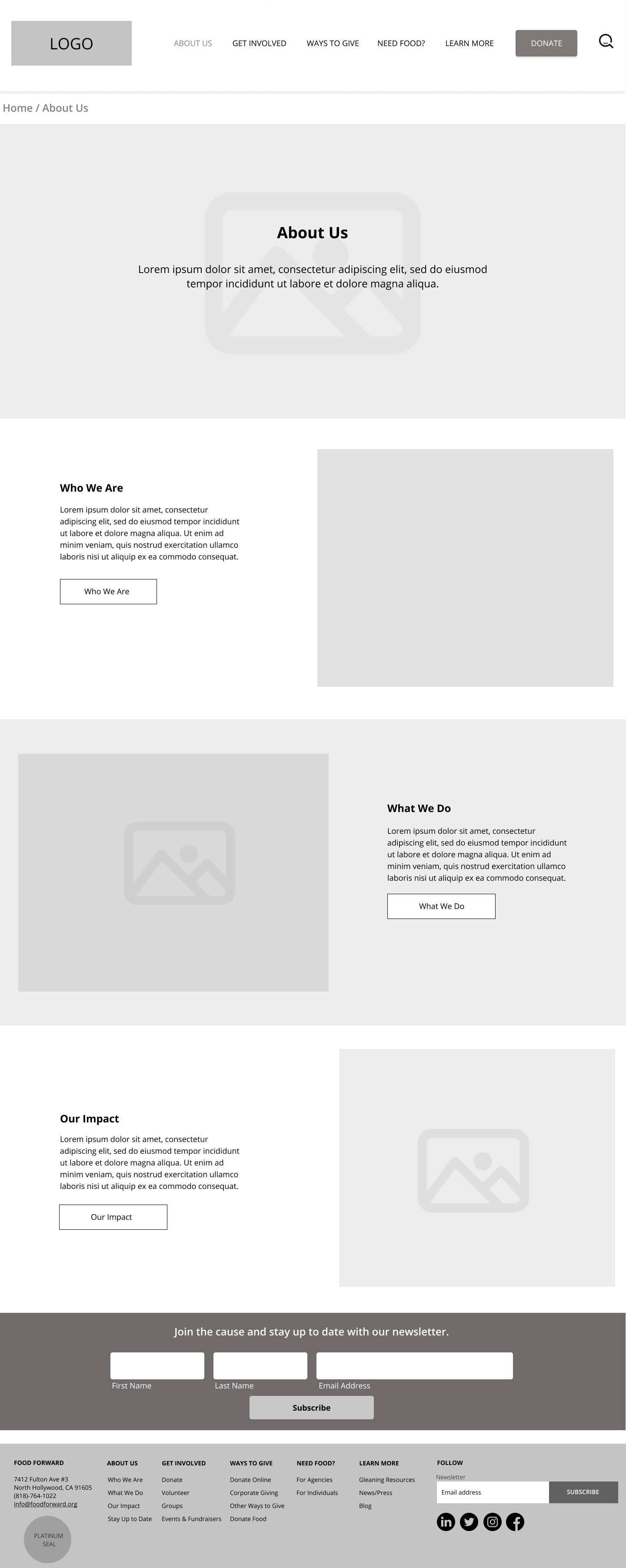
Home Page/Landing Page
I began designing the home page and the landing page first because these were the main pages of the website that the users would be seeing. I wanted to include the mission statement of the organization and include a direct link to volunteering, donating and ways to give so that users wouldn’t have to spend time searching. Because one of the primary goals of the website was to increase newsletter sign-ups, I wanted to include the newsletter sign-up at the footer of each page to encourage users to subscribe. The landing page was very similar to the home page, but was much shorter and focused on donations as this was the primary goal of the landing page.
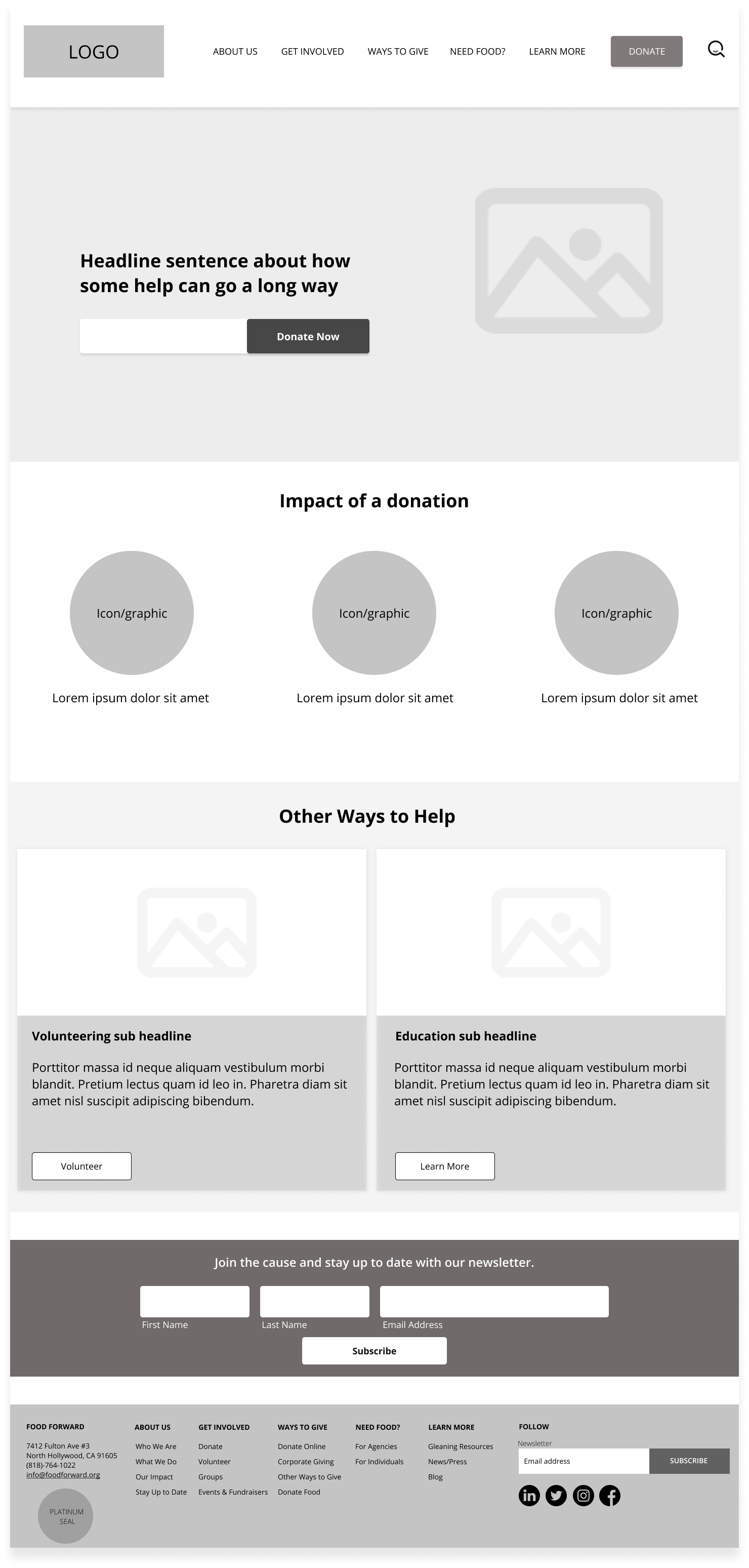
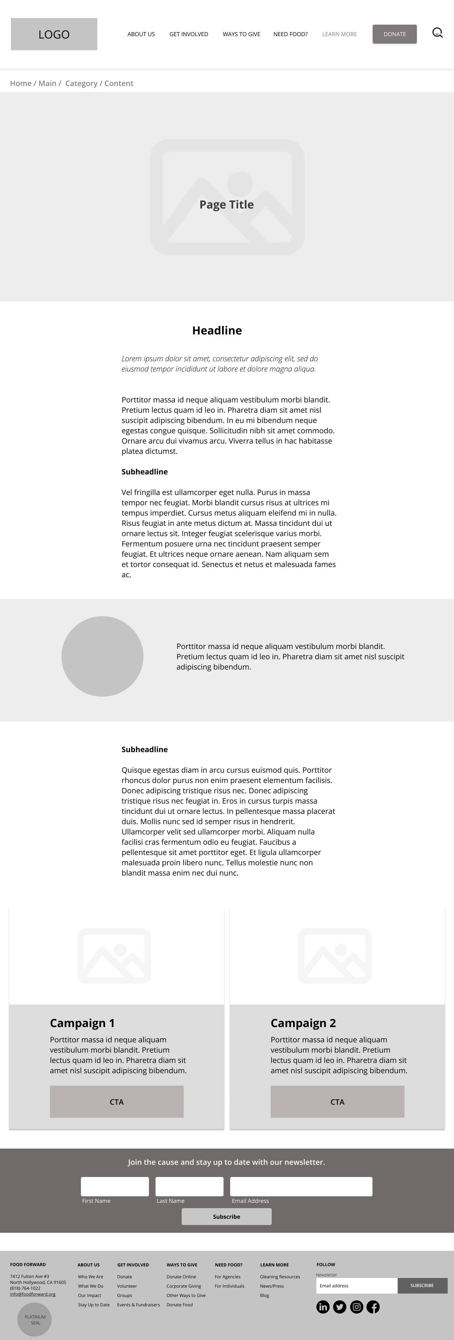
Main Page/Sub-Main Page/Content Page
For the main pages, these pages would be if a user were to click directly on the navigation menu. These main pages would explain that section of the navigation and include the sub-main pages that you would see if you were to hover over the navigation. I wanted to be able to create very general and clear main pages and sub-main pages as these would be how the users would navigate and get basic information. I also wanted to include breadcrumbs so that the user would understand where they were at all times and would be able to go back easily if needed.

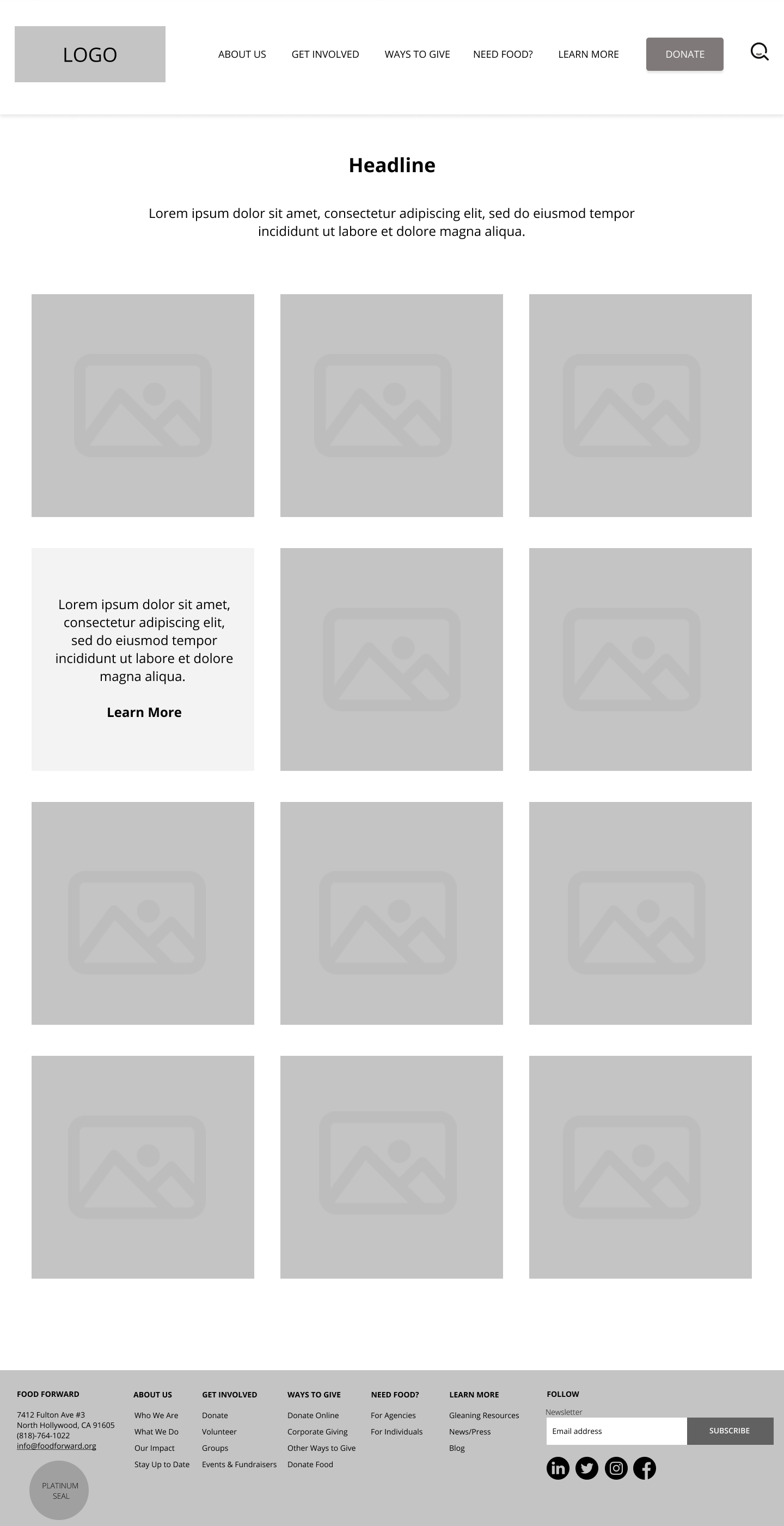
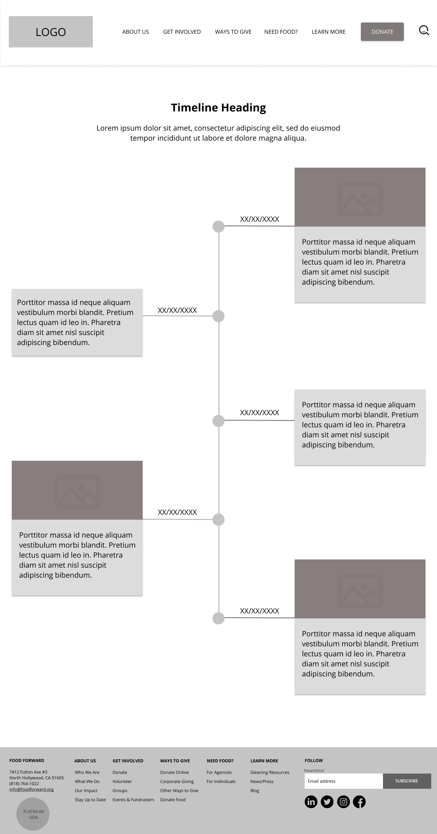
Extra Pages
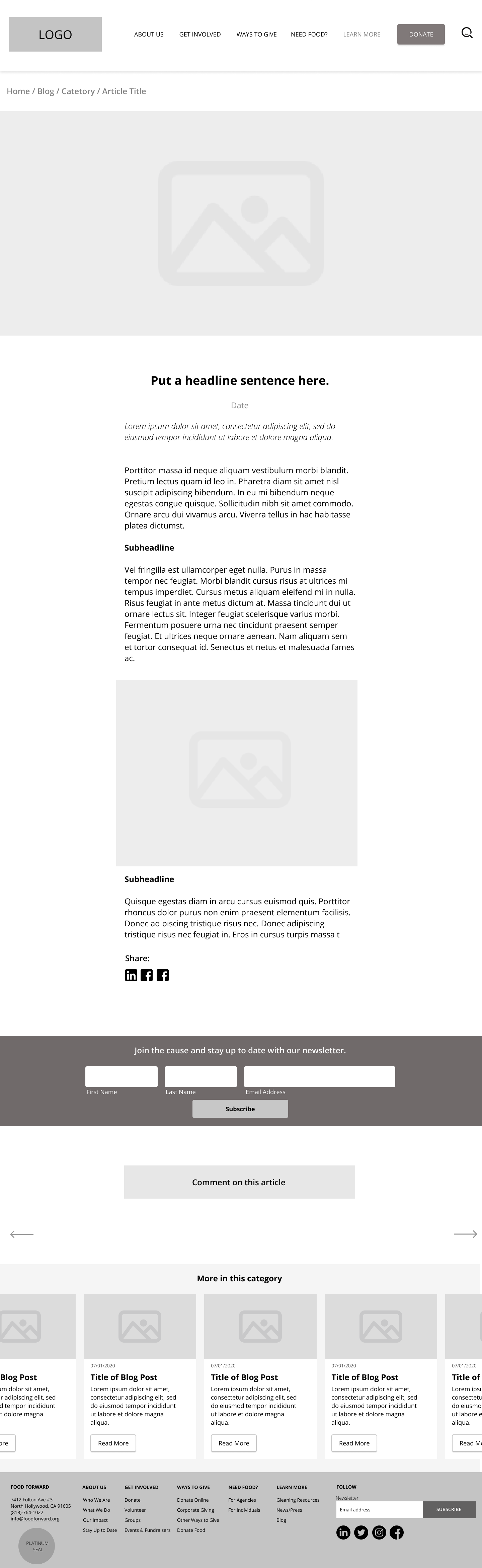
Because their team had liked the general templates that I had created, they had asked to extend my work with them and asked me to build some more pages for their site! I had the extra time, and really enjoyed working with their team so I had agreed to create a few more pages for them! Something essential that they had on their website was their programs they ran, and they wanted to have a programs page that listed out all their programs and detailed them. They also wanted a gallery, a newsletter sign up page, a timeline, and a blog post page. The below are the mid-fidelity wireframes that I had created for these pages!

REFLECTION
Working on a project that would be getting shipped out was an extremely exciting experience. I am continuing to help their team with whatever they need as the developers are beginning to create the templates that I have created. Being able to work with an incredible team for a great cause that I really cared about, made this project very meaningful to me. It made me realize how essential research and testing is to a project and how important collaboration is. Because the Food Forward team was hiring volunteers, I wasn’t always able to communicate with the person who had done the website audit, or the person who performed the tree testing. I had to gather up the research and perform research of my own in order to get a strong understanding of the users and the goals of the website.
I wanted to be able to create a website that not only looked beautiful but one that produced actual results. As the website should be going live in October, I’m hopeful to see an increase in visitors to their site, and an increase in the number of donations and volunteers. I believe that with this new website, the Food Forward team will be able to achieve their goals, and I’m happy to have contributed to such an incredible organization.