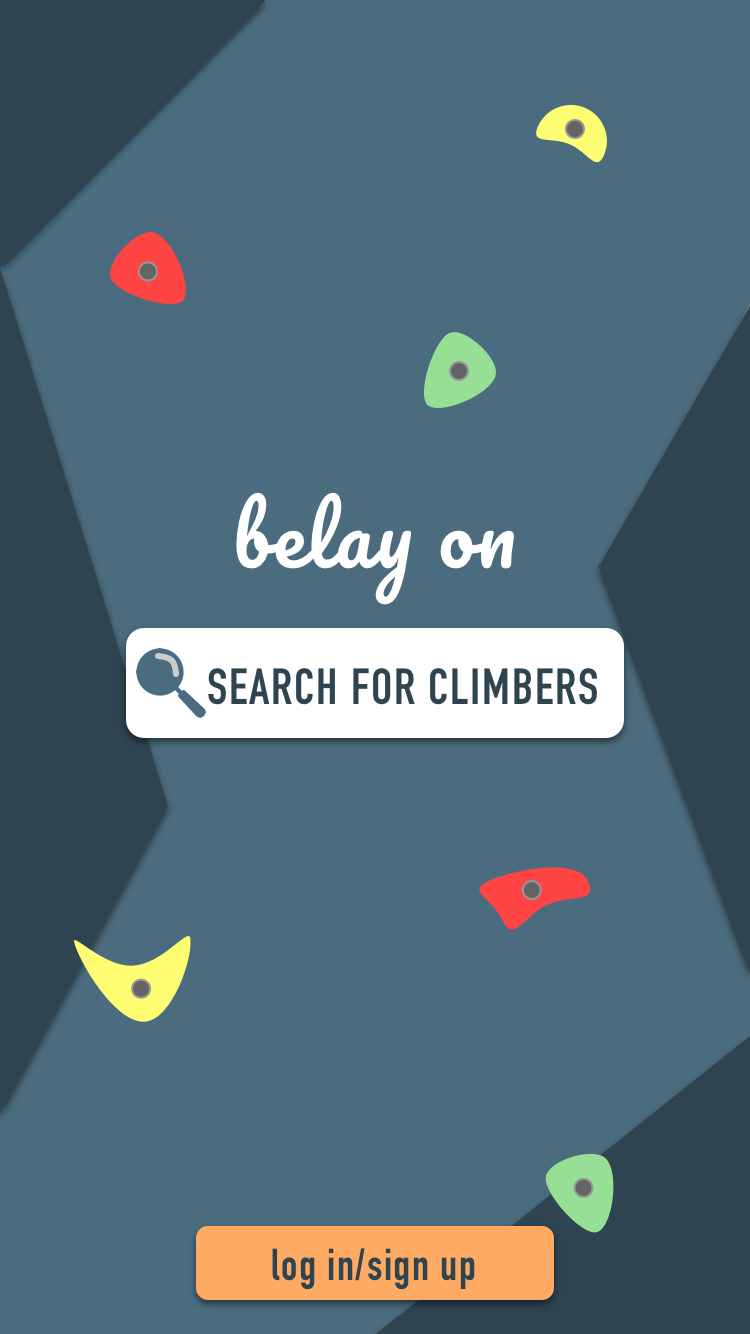
Belay On
an up-incoming application uniting climbers from all over the world.

Belay On is an application that connects people. Whether in your hometown, or in another country, Belay On works to unite climbers from all over and create a strong community.
Background: Capstone UX Academy Project
Roles: UX research, UX/UI design, Usability Tester
Tools: Sketch, Marvel
Time frame: 4 weeks
THE CHALLENGE
Find a problem that climbers commonly face and create a solution.
RESEARCH

User Interviews

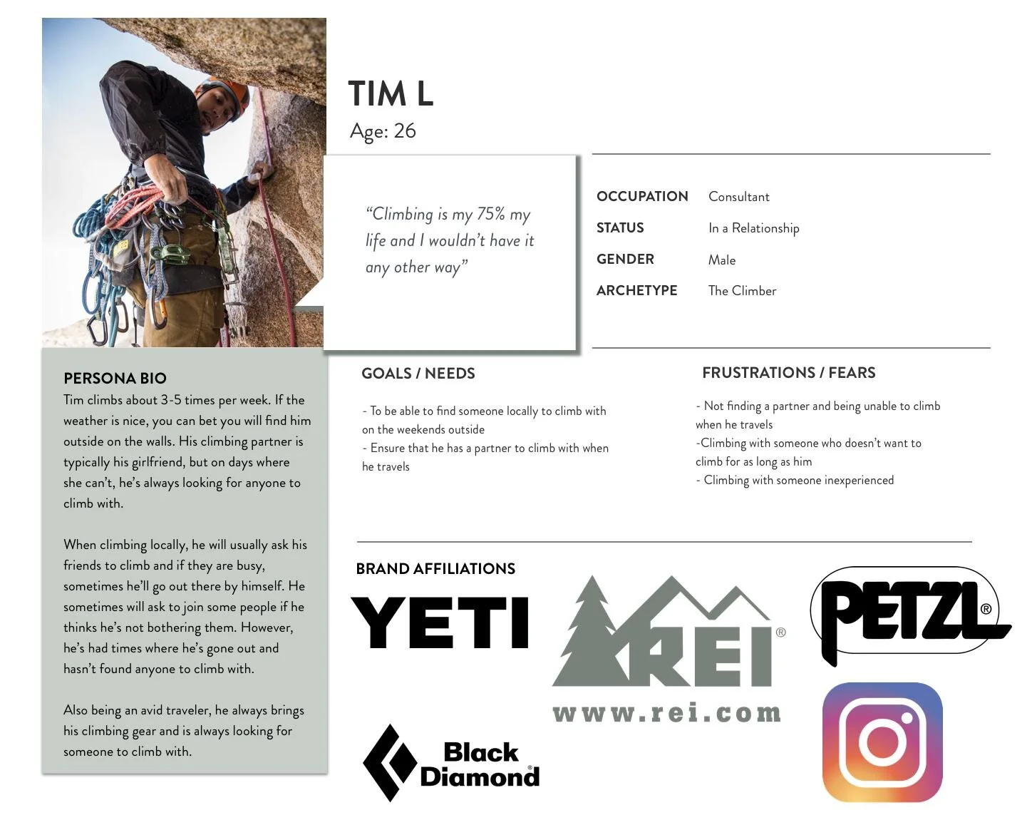
Persona

Empathy Map
In order to find a solution, I needed to discover some pain points that climbers had in their daily lives. I gathered 3 individuals from the climbing community in Austin to perform 2 rounds of user interviews in order to get a strong understanding of who my target users were.
Round 1: Tell me about how climbing fits into your life.
In the first round of interviews, I focused on what general issues climbers had. I asked questions on their lifestyle and how climbing fit into it. I wanted to know how often they climbed, where, when, for how long and issues that they were constantly noticing in their life. This interview was a casual conversation about their daily lives and experiences. Through this interview, I found that climbers mainly had issues with:
Navigating to climbs outside
Finding partners to rope climb with
Round 2: Tell me about who you climb with and how you find someone to climb with.
In the follow up interviews, I decided to focus on the issue of finding a climbing partner as this is also an issue that I have encountered many times. Each interview I conducted all said this was one of their biggest issues. They all had said that they would all love to rope climb more if they had someone to climb with whether it be at the gym or outside. For some climbers, because they travelled a lot to climbing destinations, one of their biggest worries was being able to find someone to climb with if they were traveling alone. Learning about all of these issues and situations that they have gone through, I was able to gain a strong understanding of who they were.
The Problem: “It’s hard for me to find someone to climb with.”
DEFINING THE USEr
Who is our target audience?
All of the people I had interviewed were all very friendly and very open to climbing with anyone. They all wanted the ease of finding a climbing partner and the reassurance that when they traveled they would be able to know they had someone to climb with. They also had said that on the weekends, they would love to see the local climbers in the area that they would be able to climb with and get to know as the climbing community isn’t too large. With the information gathered from the interviews, I created a persona that would be our target user for the application.
Empathize with the user
What does our target user experience in their daily life?
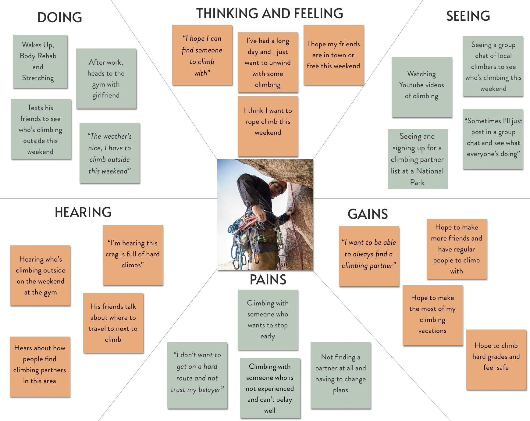
With this persona, and our user interviews, I created an empathy map so that we could get a full understanding of our desired user. I referred back to my Round 1 interviews as I wanted to fully grasp what the user would be doing, thinking, seeing, and hearing on a daily basis and how this application could fit into that lifestyle.
After creating our target user, I created about 10 “How Might We” statements. I wanted a statement that would be able to get my creative juices flowing, and one that would generate the most ideas. The below statement is the one I had chosen as this is the problem I wanted to solve.
“How might we connect climbers with each other so they will never have to worry about finding someone to climb with?”
BRAINSTORMING
How many ideas can I come up with in 5 minutes?
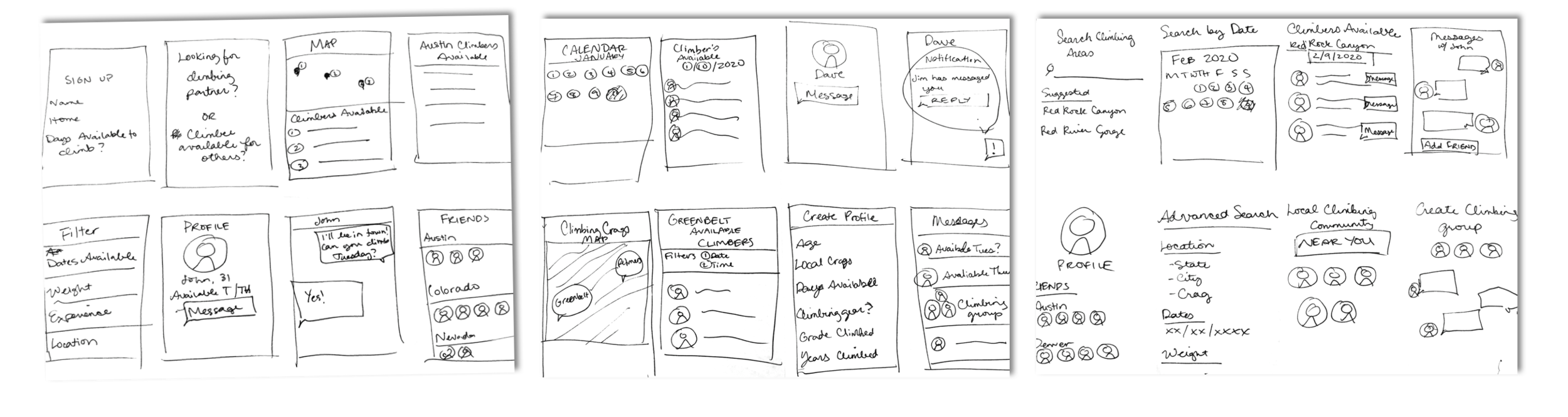
After creating my “How Might We” statement, I used that question to think of as many ideas as I could. I set a timer for 5 minutes, folded my paper into 8, and drew out as many ideas as I could think of. The goal here was quantity and not so much quality (as you can see in the drawings below). I found that the idea I liked best was to create an application that allowed climbers to find a climbing partner based on location, date and availability. To elaborate on this idea, I needed to create a storyboard.
What is the best storyboard I can come up with in 5 minutes?
After performing this ideation phase, I found that my best idea was to create an application that allowed climbers to find each other by location, message each other and create reservations to climb with one another. Using this idea, I then performed another round of crazy 8’s, but this time creating a storyboard. I wanted to create the best possible storyboard for the idea, so that I would be able to create a user flow easily and start designing my wireframes.

I decided on a storyboard where the user would be able to search by location where they needed a climbing partner, and then would be able to search by date or availability and reserve a climbing partner for the dates they were searching for. Having this storyboard as my reference, it was time to create a user flow.
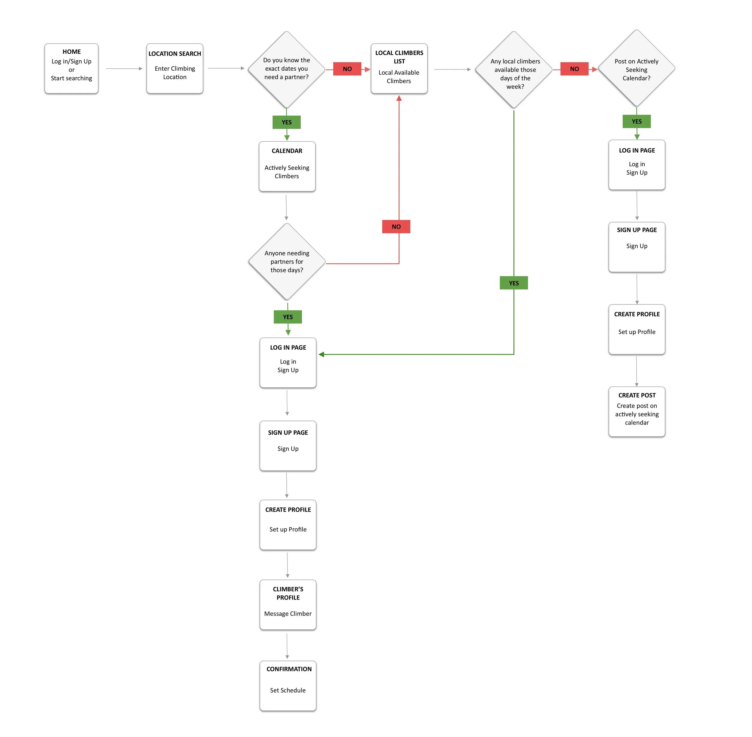
How will the user find and reserve a climbing partner?
I needed multiple ways for the user to find and reserve a climbing partner. I knew that the initial search would be based on location, so that was our user’s starting point. I also wanted the user to be able to search for a climbing partner before they had to sign up for the application so they would be more enticed to use and sign up for the app after seeing how it worked.
DESIGNING THE SOLUTION

LOGO DESIGN
What should we call the application?
I went back and forth in this. “Belay” is a common phrase that climbers use when rope climbing with partners to know that they are protected when climbing. I was in between the below names for the application:
Belay Me
Belay On
On Belay
How should the logo and the colors of the app look?
I ultimately decided on “Belay On” as that phrase rolled off the tongue easily and climbers also use the phrase “Climb On!” a lot. I wanted the design of the logo to be in cursive with a look that was similar to a curled rope.
I wanted the colors to be bright and similar to how climbing gyms look. Because climbing gym walls are always covered in bright and different colored rocks, I wanted the application to look the same so that people would enjoy using it to find climbing partners.
CREATING THE WIREFRAMES
For the wireframes, I wanted the users to be able to perform the following actions:
Search by location
Create an account
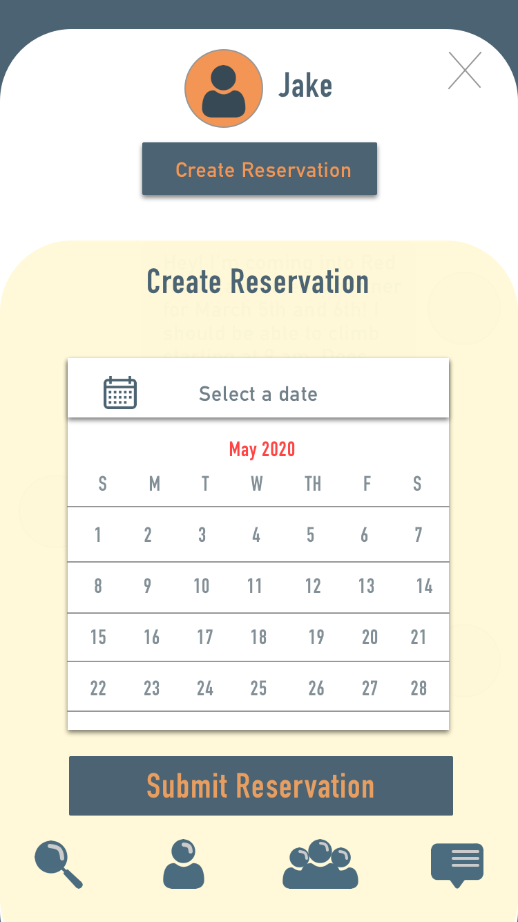
Confirm a Reservation
Create a posting
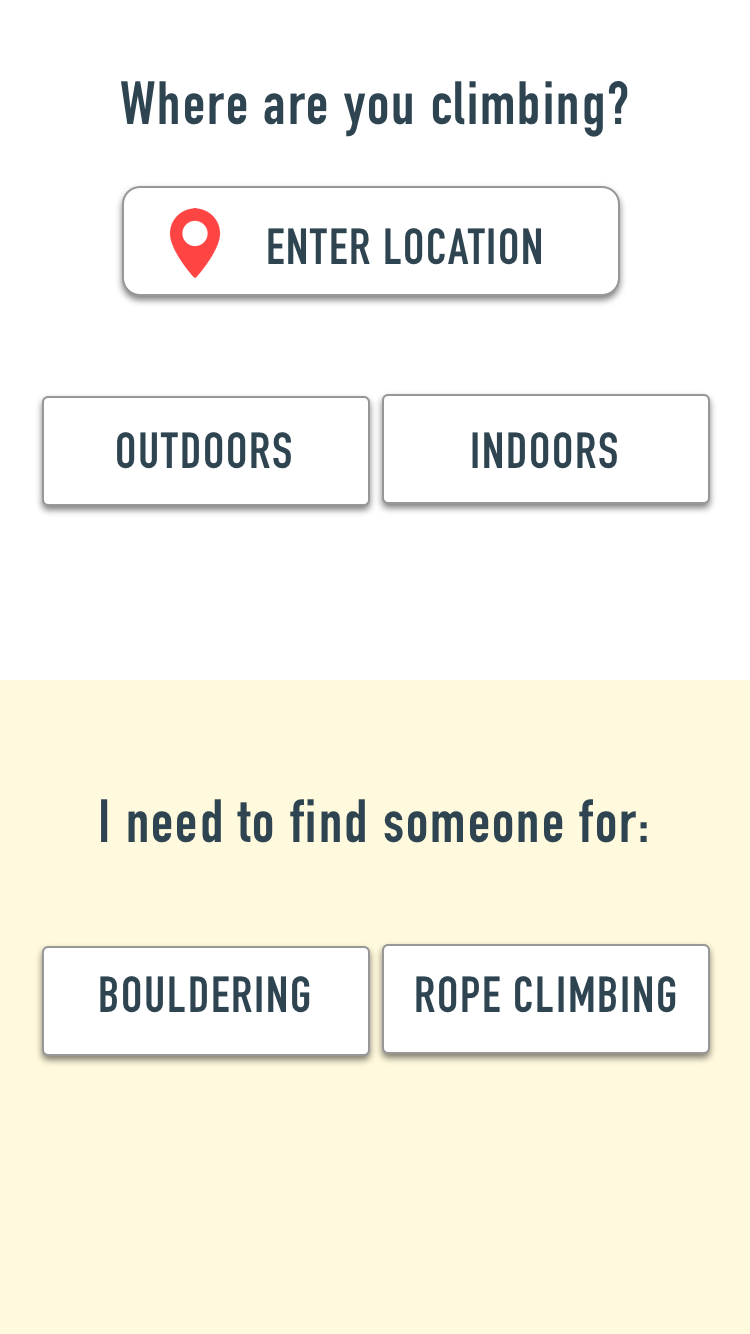
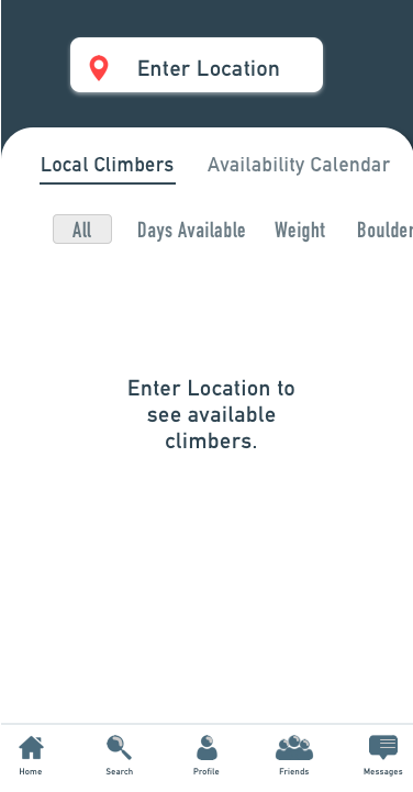
Searching By Location
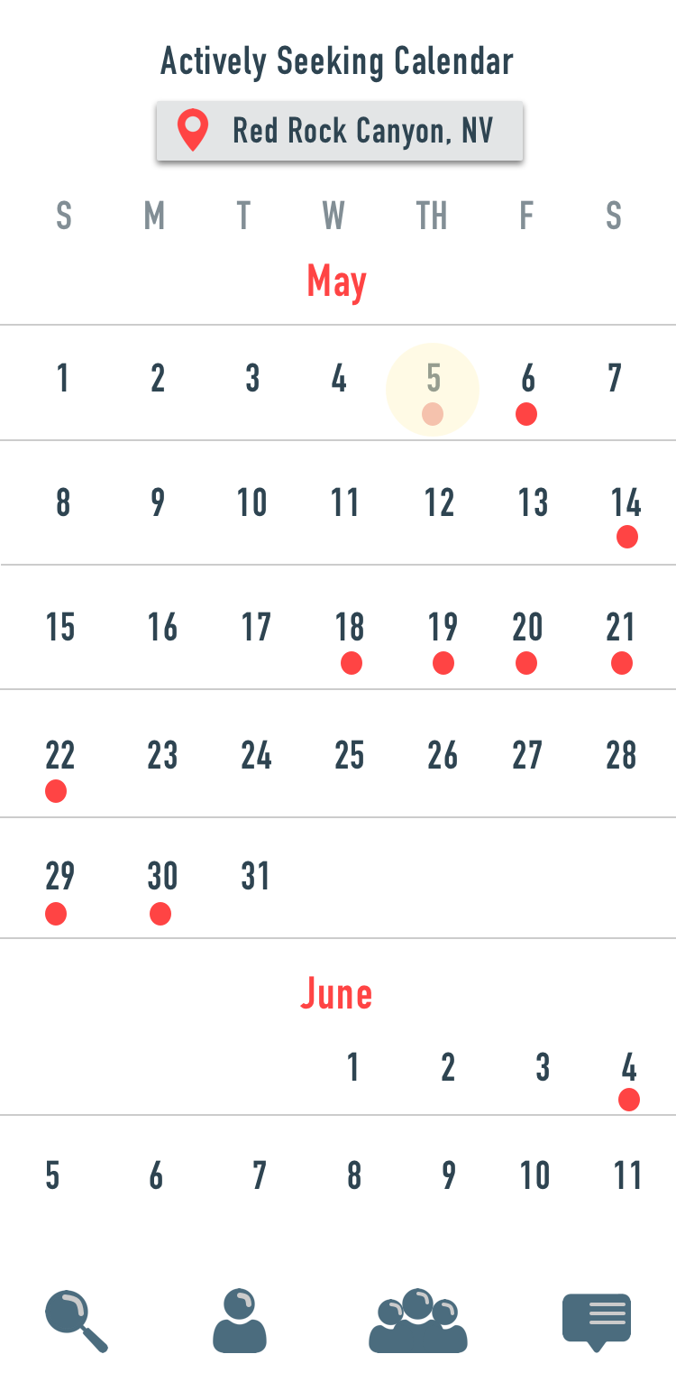
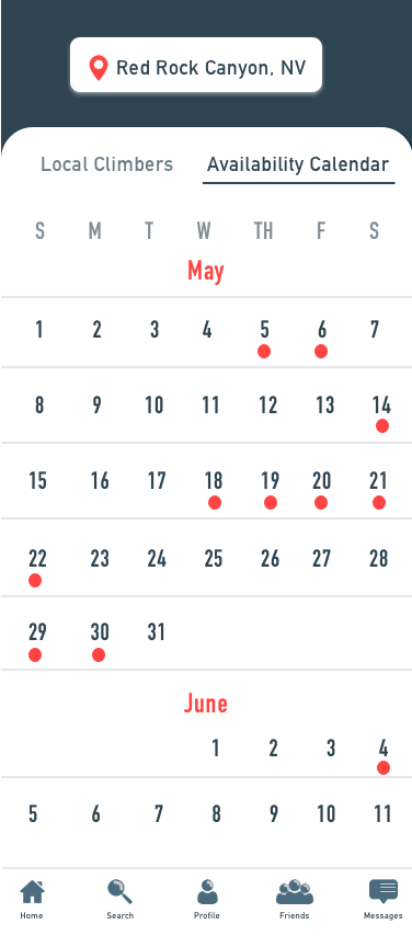
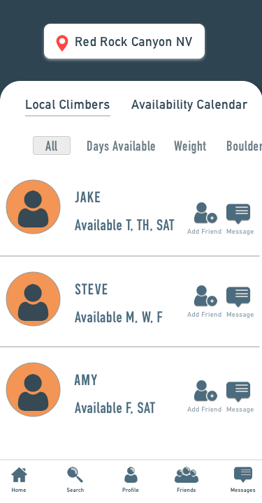
I wanted the user to be able to begin searching by location so that it would narrow down the amount of climbers. During my user interviews I found that many climbers search for climbers locally, or while traveling. Because of this, I wanted the initial search to begin with location and then the user would be able to search from the availability calendar or by local climbers list.
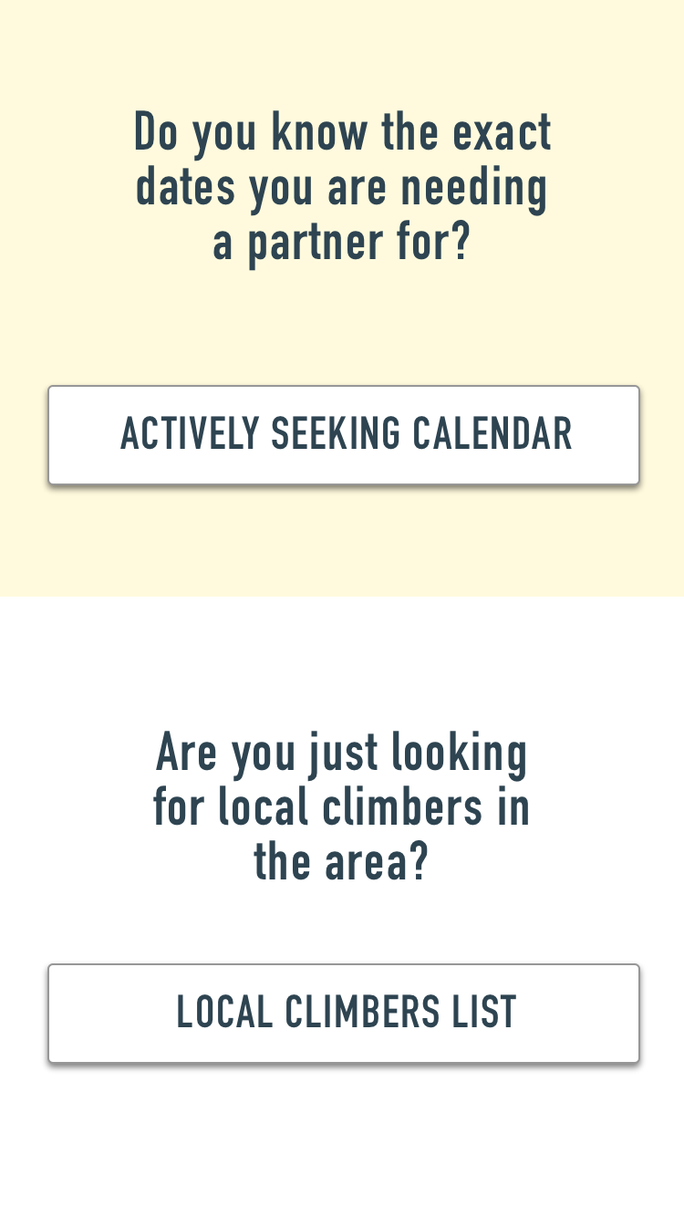
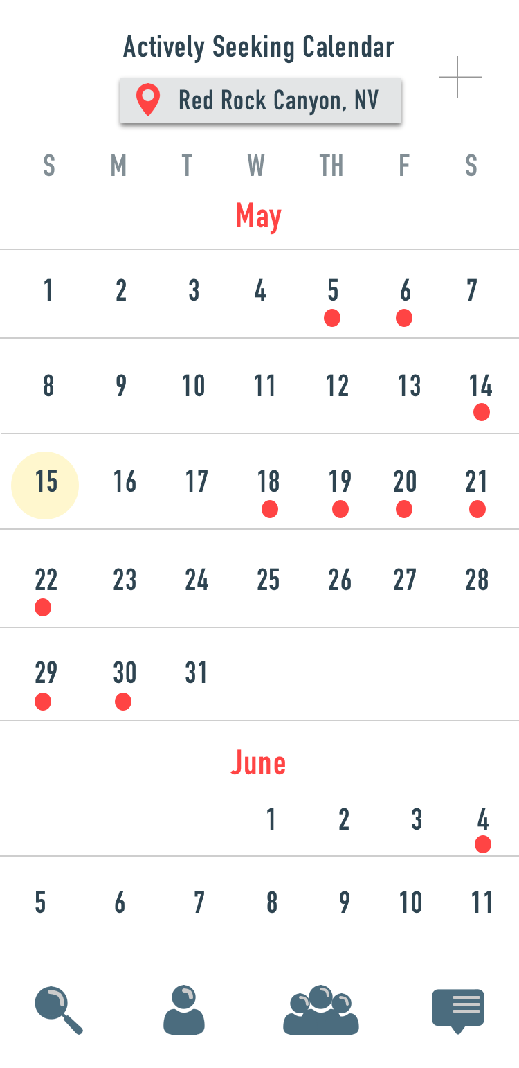
The availability calendar would be where climbers who were actively searching for partners on specific days would post.
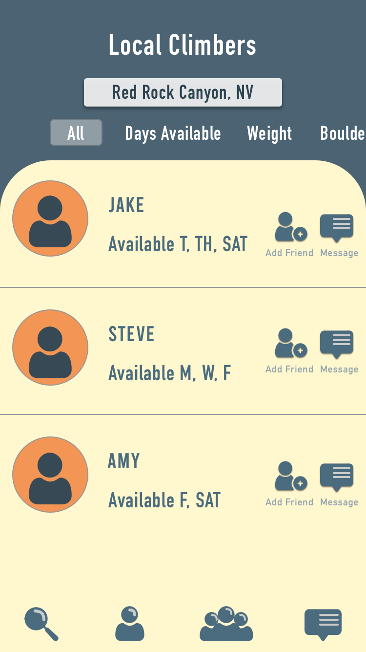
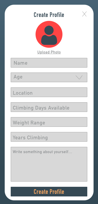
The Local climbers list would be climbers who live in the area and have signed up for the application and are open to climbing with anyone.

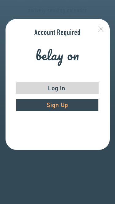
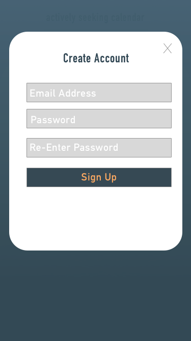
Create An Account
By allowing the users to search the application without having to log in, I needed to find a way to get users to sign up. By requiring the user to have an account before they are able to message someone or creating a post, this would incentivize the users to sign up for an account.
Confirm A Reservation
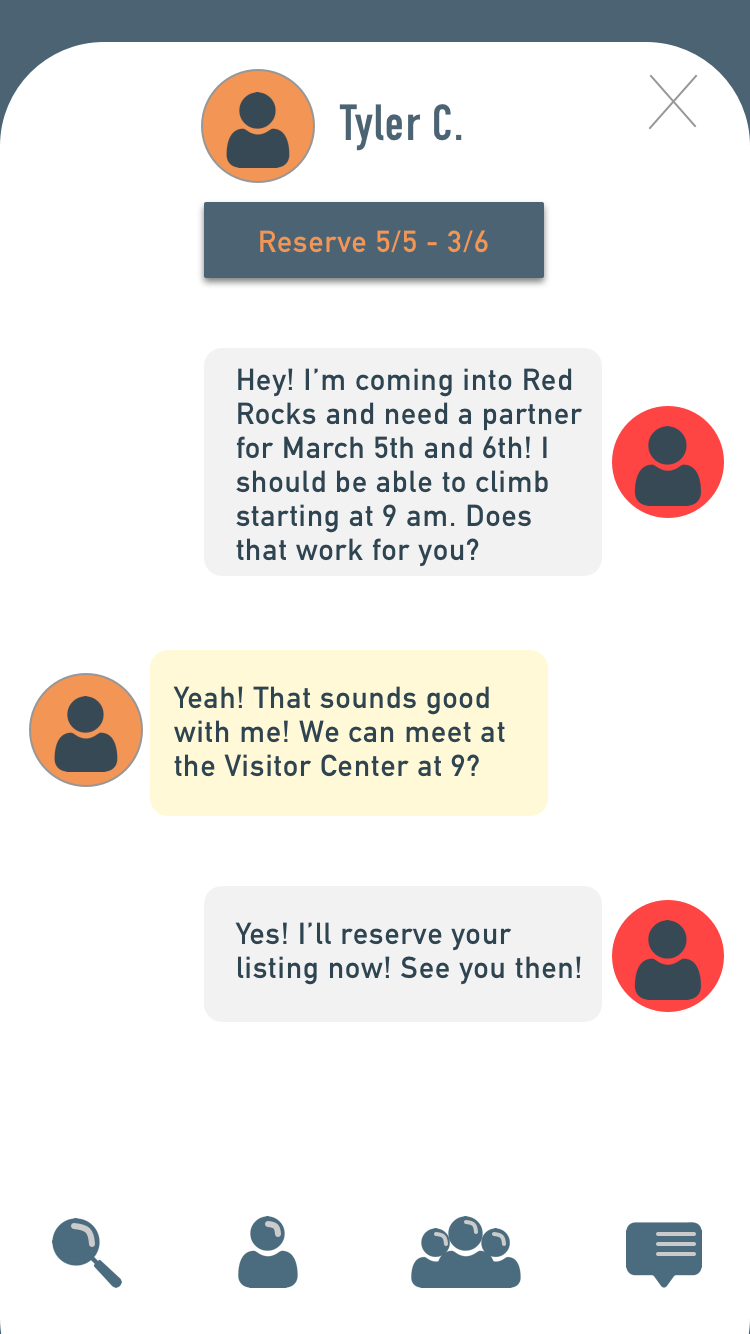
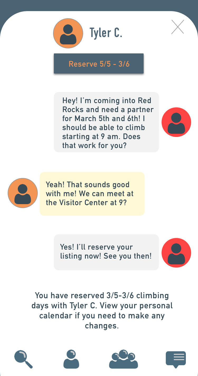
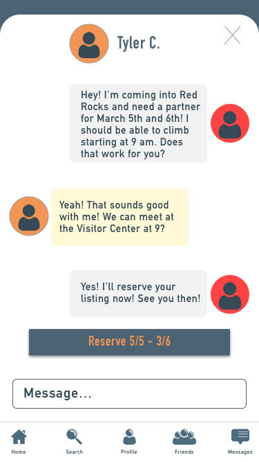
The main purpose of the application is to be able to find a climbing partner. I wanted to create an easy way for the climbers to easily book a climbing reservation with another partner. If they were to find someone on the actively seeking calendar, they would be able to chat them from their post, and reserve that listing directly from the chat. This would create an easy way for the climbers to make an official reservation with another person.
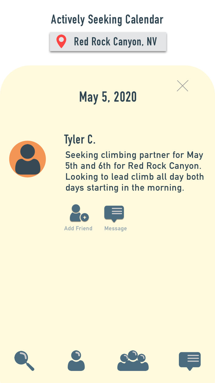
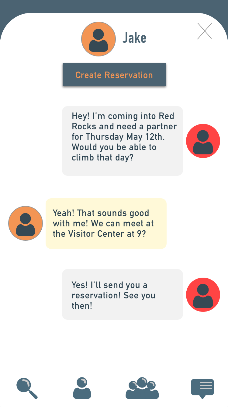
If the climber was not able to find someone on the “Actively Seeking Calendar”, they could then check the list of local climbers in the area. When the local climber signs up for the application, they have the option of adding themselves to the local climbers list and showing what days they are usually available to climb. This list gives other climbers a chance to meet or climb with local climbers in the area. After they chat the local climber, they are able to “Create A Reservation” directly inside the chat.


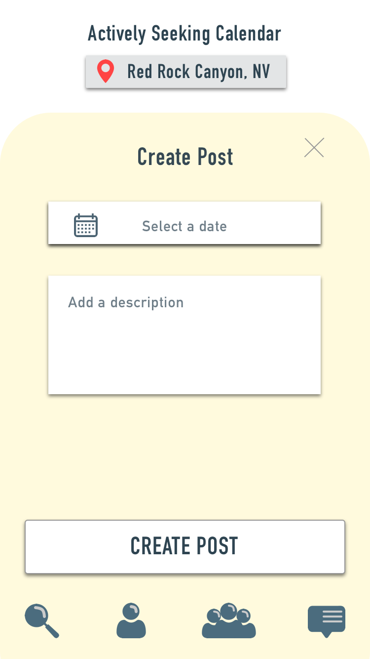
Create A Post
If climbers have searched the app and were unable to find someone for the specific day they needed, then they would be able to create a post on the availability calendar. Once it has been posted, other users will be able to see the post and message the climber and confirm the reservation like the process above.


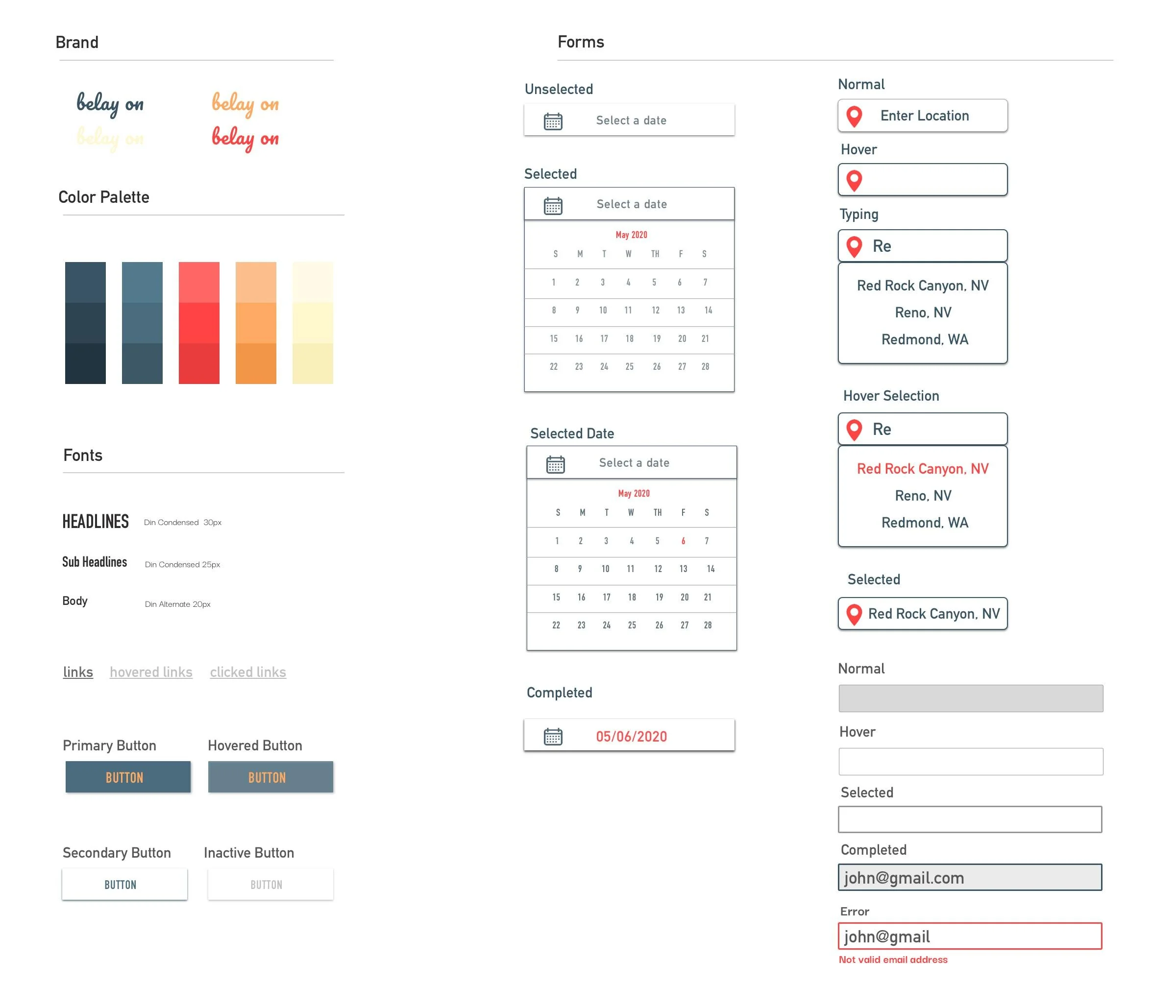
UI Kit
After creating the wireframes, I put together a UI kit that encompassed all of the design elements that I wanted to include in the application. This included the drop down calendars, the buttons, the fonts, color palette, and how errors would look when signing up for an account.
With the wireframes and the UI features designed, I was ready to put it all into a prototype using Marvel and begin my usability testing.
TESTING
How did the prototype test on climbers?
I gathered 3 local climbers to test my prototype. Because there were three different flows that the user could take based on the task, I tested all the participants for every flow randomly. The prompts I had given each participant were:
- User A: Find someone to climb with on May 5th
- User B: You don’t have work Thursday so you are hoping to find someone to climb with locally.
- User C: You need to find someone to climb with on May 15th.
The usability testing gave me very helpful feedback. The main feedback I received was on the navigation bar, and the questions that were prompted in the beginning of the flow. Many of the participants had questioned if there was a home page and said the navigation menu wasn’t very clear. They also said that the questions in the beginning seemed a bit unnecessary and wordy. They also had some trouble confirming the reservation in the chat box as the button wasn’t very clear. All the participants were able to complete the tasks with a bit of guidance and all of the climbers who performed the testing all agreed that the application would be very helpful and useful. With all this feedback, I created an affinity map to summarize the testing results in order to make my priority revisions.
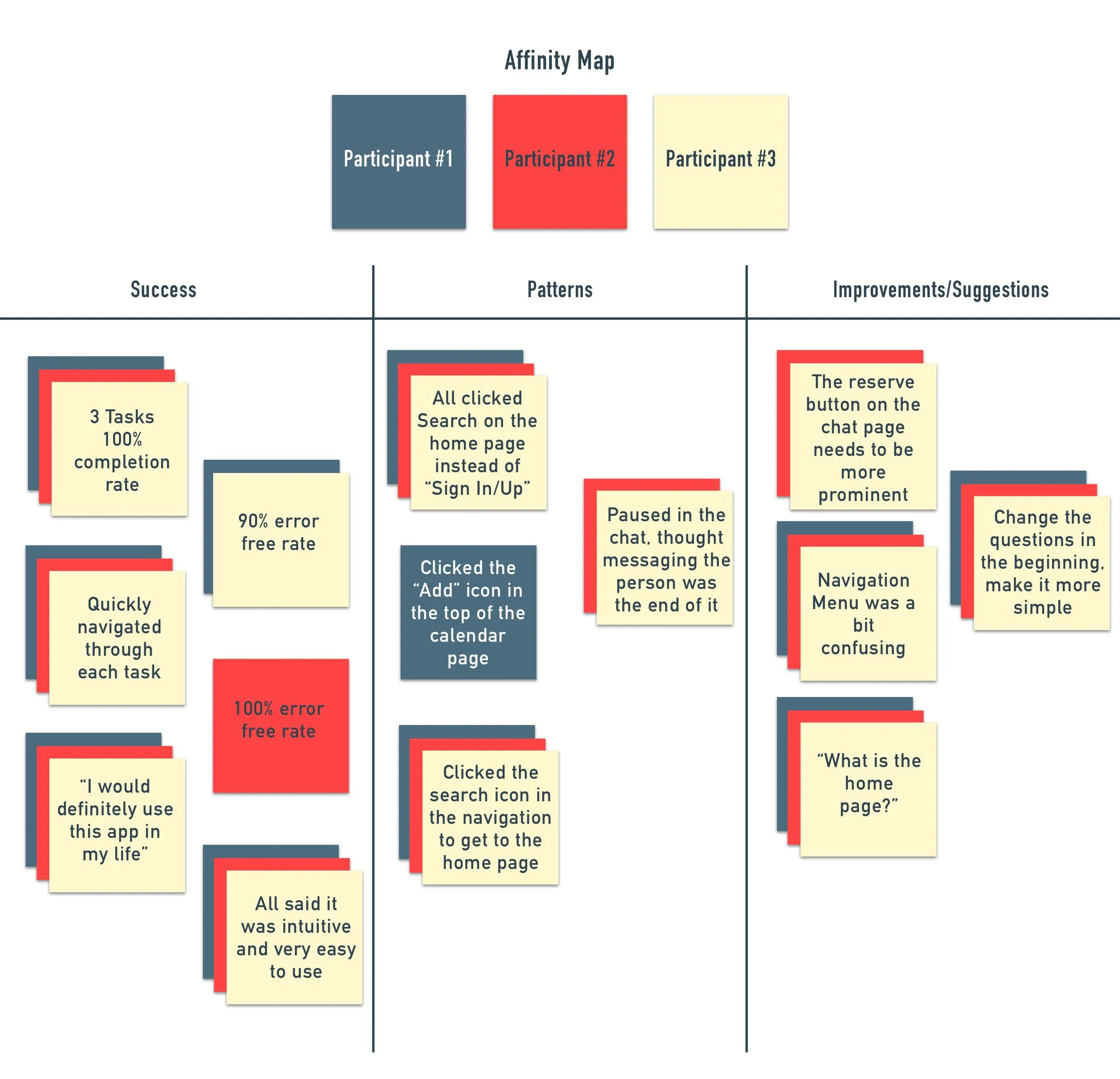
The Results
HOME PAGE
With this helpful feedback, I then worked on some priority revisions. I decided to remove the questions at the beginning and create a Home Page where you would be able to access both the list, and the calendar. This was the biggest feedback that I had received in the testing as the user’s did not understand the questions and had questioned what the home page would be when you opened the application each time.
NAVIGATION MENU
I also re-did the navigation menu as some users had questioned the navigation menu and what each icon had stood for and also questioned where the home page would be. I added the home icon to the menu and also added a description of the icons underneath. By adding descriptions to each icon, this should make it easier for the user to navigate around the application.

RESERVE BUTTON
Another revision I had made was moving the button in the chat box. I wanted to make it obvious for the user and place it at the bottom of the chat screen so that the user’s eye would be drawn to it when chatting with the other person.

I also made some edits to each of the pages to clean up the look, and make the application look more professional. Below you can see all of the final pages in the prototype below.
REFLECTION
Creating a new application was a very eye opening challenge. I wanted to be able to create something new that hadn’t really existed before and this had proved to be very fulfilling as climbing holds a huge place in my heart. To see data-driven results, I would hope to see an increase in users signing up. Because the application requires an account to message others and create postings, the number of new accounts would give me a strong idea of how successful the application is doing.
I definitely want to develop this application further and perform another round of usability testing with the new prototype. I believe that these changes made the application more professional and easier to use and I would love to have more feedback from the climbers in our community. I would also want to work with my local gyms to see how I could incorporate their businesses into the application so that climbers would be able to find a partner at the gym. I was very passionate about this project and would definitely use it if it was developed, which is something that I hope to bring to all my future projects.