My Offers
A home on the mobile app for all of your personalized offers
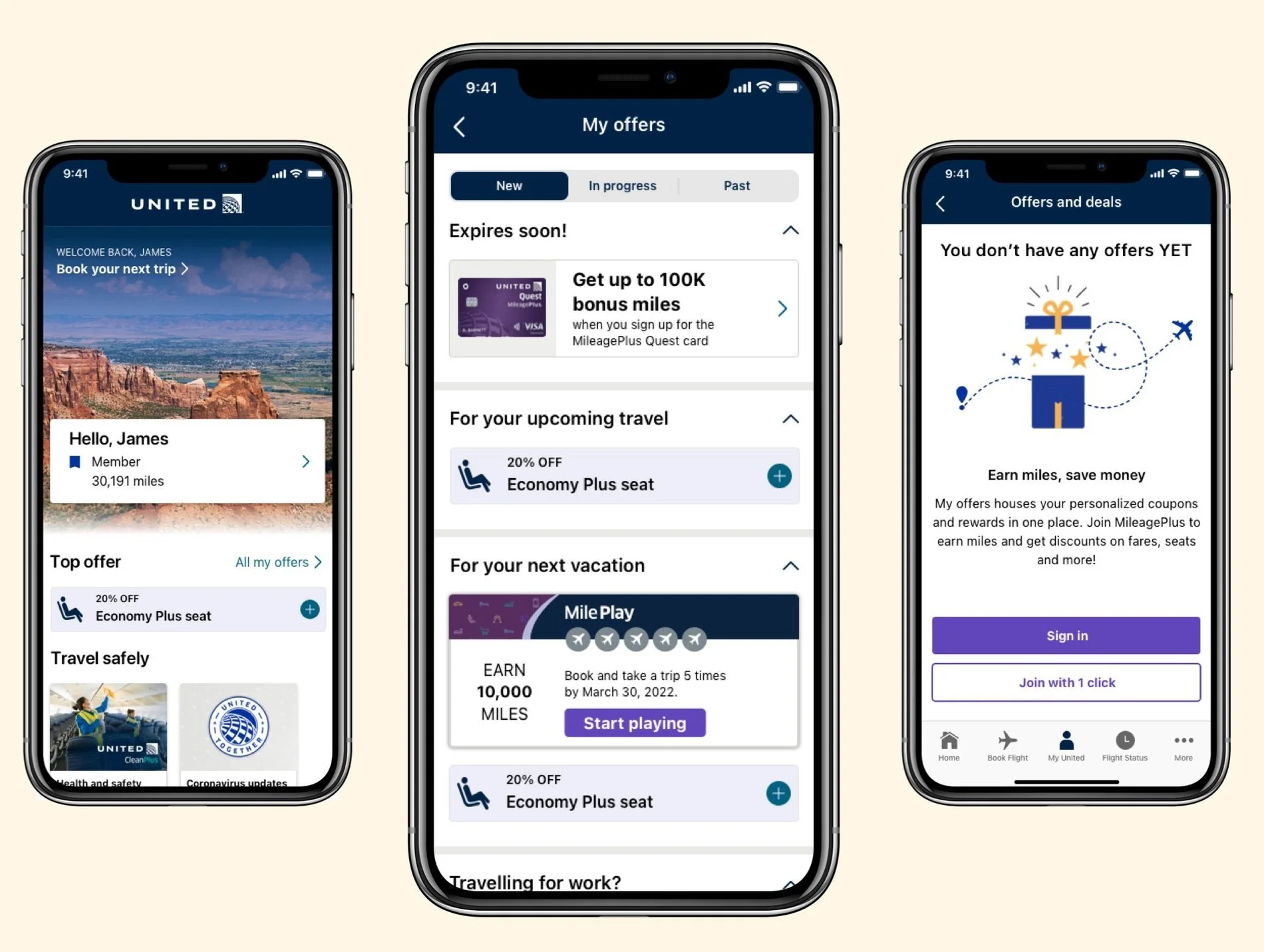
My offers is a home for coupons and rewards generated from machine learning models based on what we know about user behavior and shopping habits.
Background: United Airlines Personalization Project
Roles: UX research, UX design
Tools: Sketch, Invision, Usertesting.com
Time frame: ~12 weeks and counting
THE CHALLENGE
Currently, United has coupons that are targeted in multiple different places, we wanted to be able to create a home where users could come to see all of the offers that they have available.
RESEARCH & DEFINE
User interviews
Competitive analysis
With the project kick off, the business team had prepared some background research and some feedback that users had provided about a reward program. It showed that United had the opportunity to drive revenue by directing users to a home for rewards and coupons. United previously had offers and rewards targeted on the home page of the app, through emails and through marketing campaigns. There was nowhere for users to save their offers or refer back to them at another time.
We had done a competitive analysis of how different industries were displaying multiple offers in a specific location on their apps and found that most shopping applications had a version of ‘my offers’. Looking at best practices across these apps, the business team defined certain requirements for the feature:
Categories for different types of offers
Instructions for how to redeem
Ranking offers by relevance
IDEATE
With our requirements in mind, I created three different designs that we wanted to test.
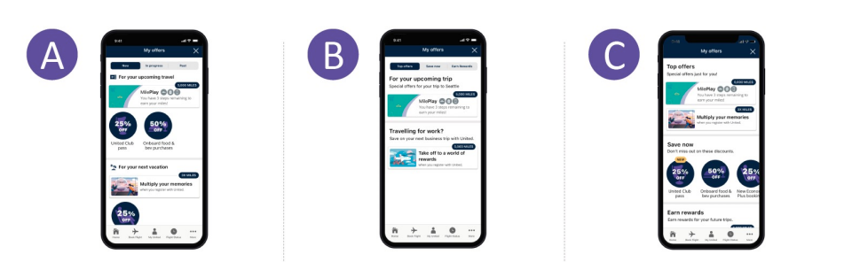
Design A was focused on separating the offers by ‘new’, ‘in progress’ and ‘past’. Design B was focused on separating the offers by ‘Top offers’, ‘coupons’ and ‘rewards’. Design C kept all of the offers on one page with no tabs. We wanted to be able to see what layout worked best for the users and what information they were expecting to see in each section.
I created the prototypes for each design and worked with our user researcher to set up the test. We set up a counterbalance test and our user researcher performed a moderated usability test.
The findings showed that the users preferred Design A. This came as a surprise to me as I was leaning more towards Design C, which is why we do usability tests! They found it the clearest and easiest to use.
DESIGN
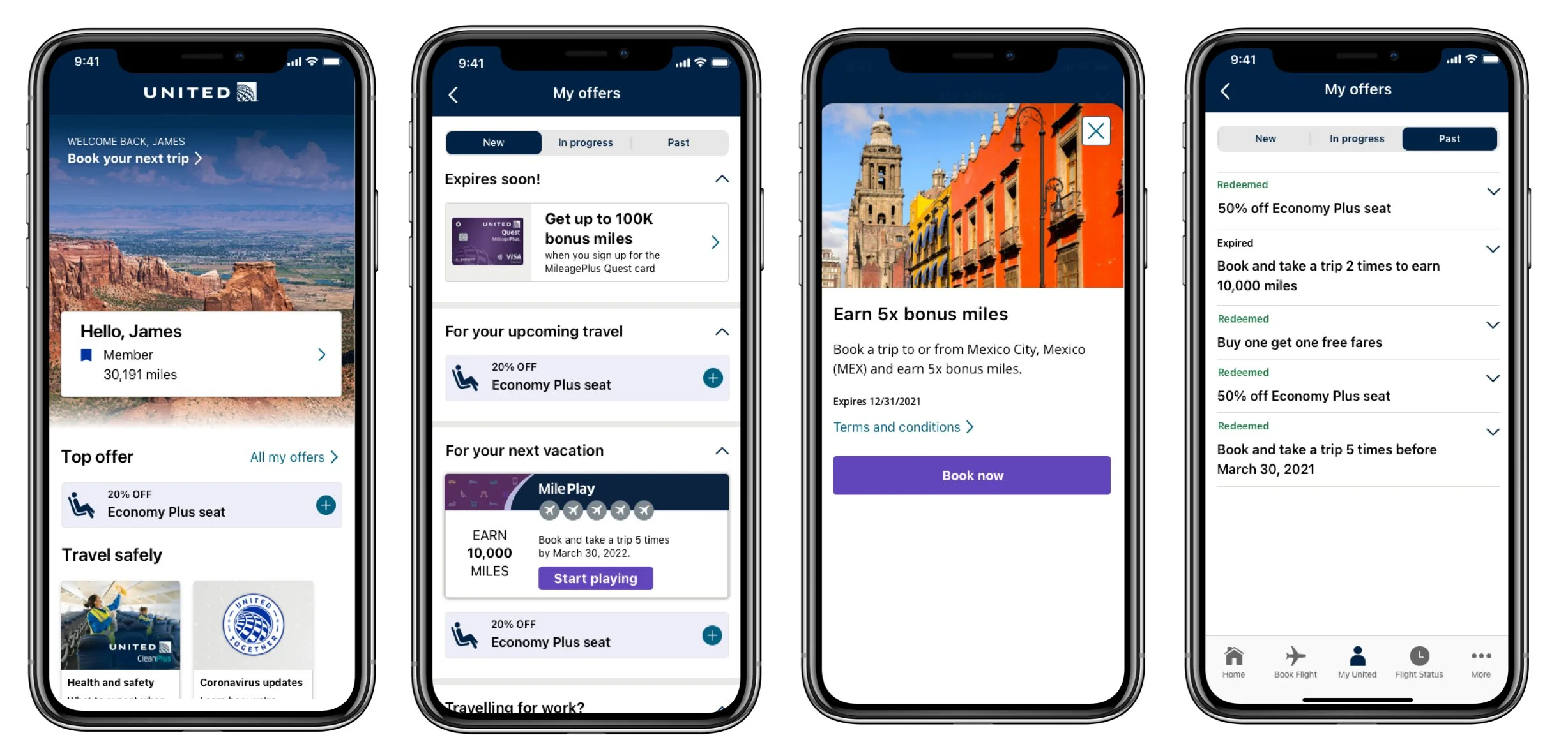
Member designs
Now that the structure was finalized, it was time to work on high fidelity designs. We wanted to be able to have different designs for coupons versus rewards so that users would easily be able to tell them apart. Coupons would be able to be added to the users shopping cart so the discount would be applied automatically. Rewards would require actions in order to redeem the rewards. From the testing, we saw that users wanted to have a color differentiation for the coupons and because the United brand does not want to feel ‘discounty’, we made the discount display smaller.
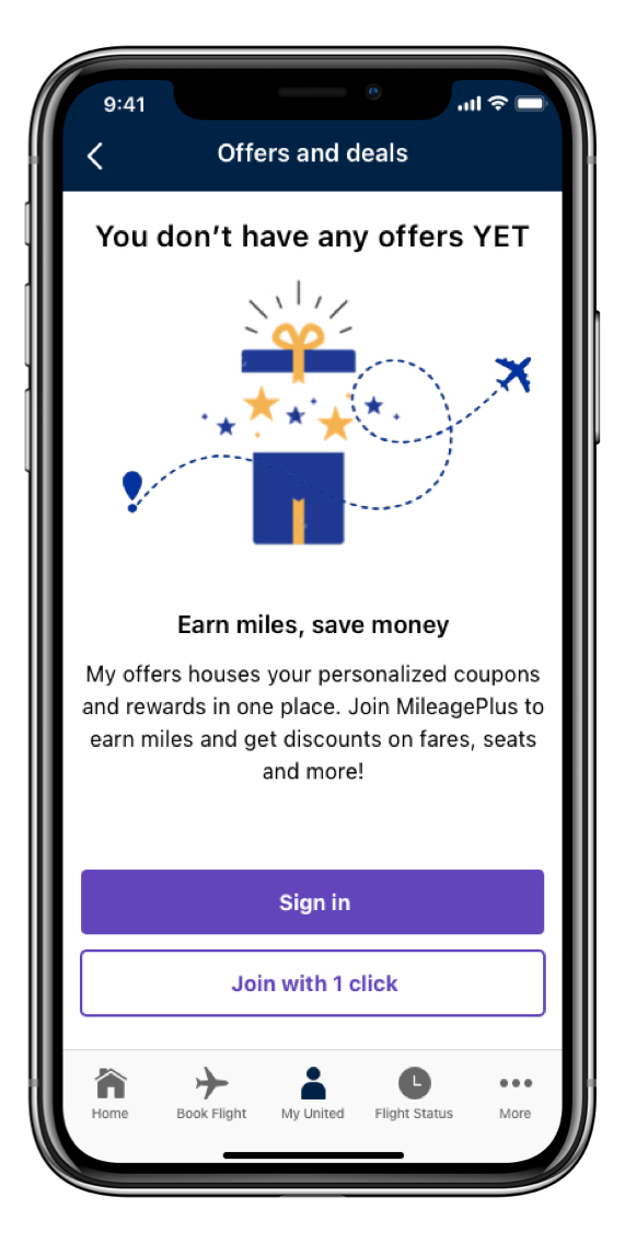
Non member design
The other scenario that I needed to design for was non-members. Non-members would still be able to access ‘My Offers’ but they wouldn’t have any offers because they would either need to sign in or sign up. I wanted to encourage those non-members to sign up and because United recently enabled one click enrollment, I thought it would work great here to incentivize users.
NEXT STEPS
After a few months of waiting, we were able to get the funding approved and have worked with the dev and business team to groom the stories for the MVP. The MVP was built and launched after I had left, but you can see your personalized offers in the United app today.
Although I wasn’t able to see the results, if I was still at United, I would want to see if there was increase in engagement with offers and Mileplay, if there as an increase in new member sign ups, and how much conversion was generated due to these offers and coupons.