Atmos Design System
Creating new components, enhancing the current system, and reviewing designs
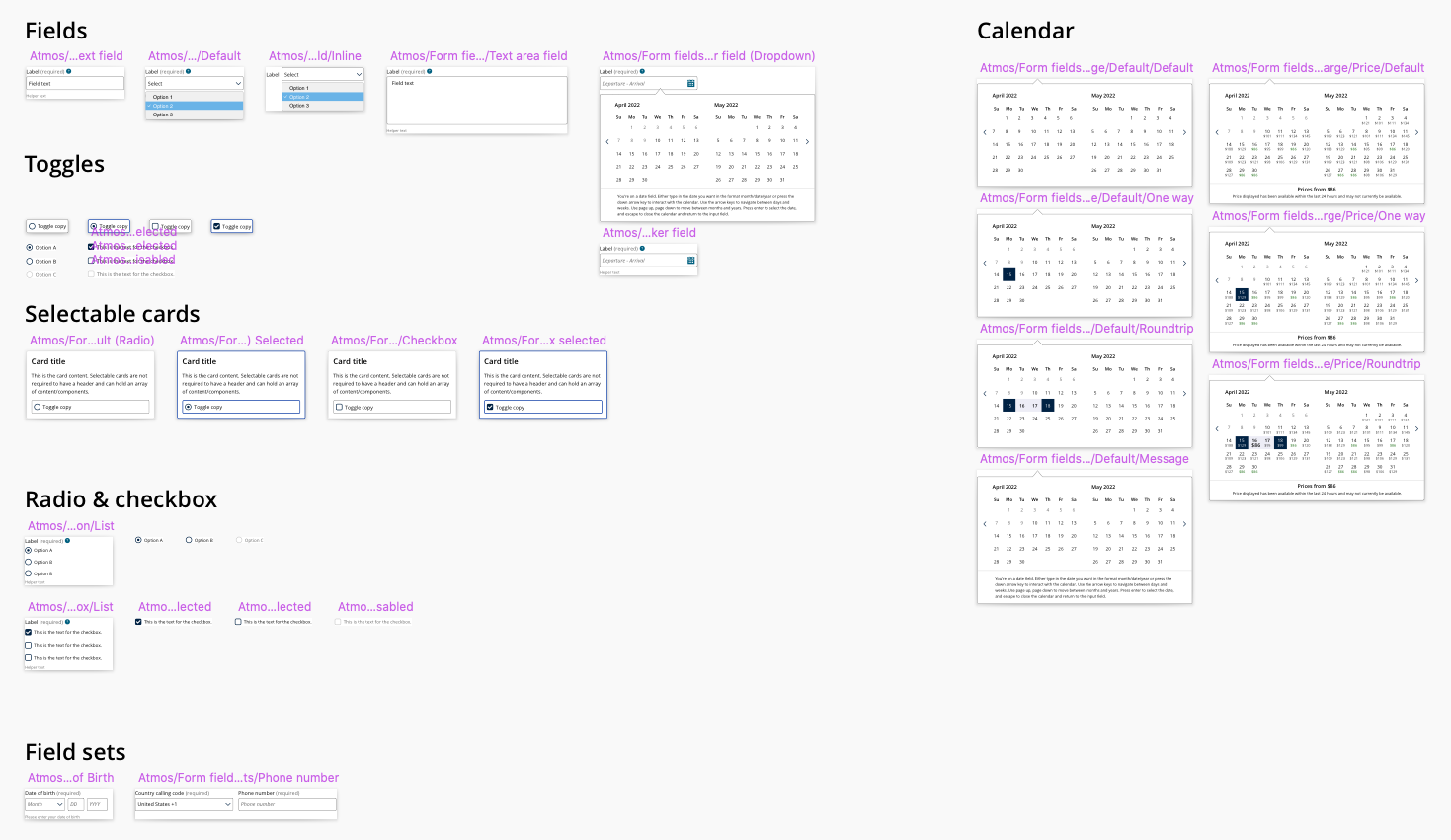
As a part of the Atmos Design System team, I work on updates to our design system, reference site, and I review UX designers projects to ensure they adhere to our design and accessibility standards.
Tools: Sketch, Invision, Zeplin, Storybook
Time frame: ~4 weeks
Background: United Airlines Design System Project
Role: UX Designer
THE CHALLENGE
Creating a left side navigation that is responsive for all devices for the United.com website that can be used for the Travel Ready Center and My United.
RESEARCH & DEFINE
When the Travel-Ready center was built on the United website, the component that was created was not responsive when in mobile. Because it was a project that was time sensitive and needed to go out as soon as possible, there was an issue for users in mobile web. When My United was created, it had also used a left side navigation that was not responsive in web that was also very different from the one created in My United. When designers came to the team wanting to utilize a left side navigation for their designs, our team wanted to be able to create a secondary left side navigation component that would be aligned across the website and responsive for tablet and mobile.
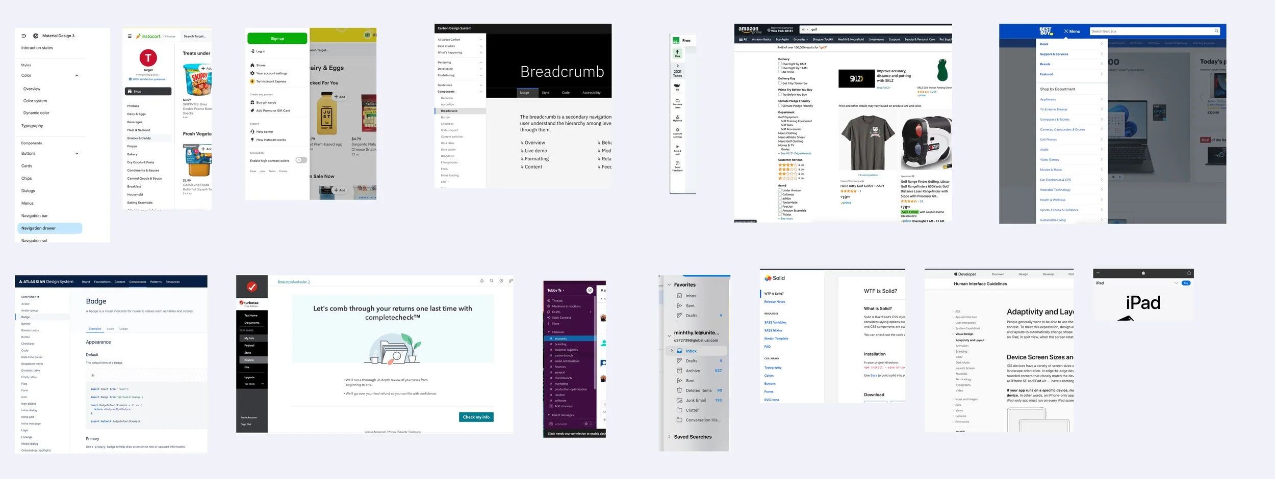
Competitive Analysis
We did some research on competitors and found different types of left side navigation that companies were using and how they were adjusting it to the tablet and mobile sizes.
Define
After getting some inspiration, we met with the lead designers of the projects that needed a left navigation, and defined what they were requiring. We took a look at what was currently live for each and identified the issues and what could be improved.
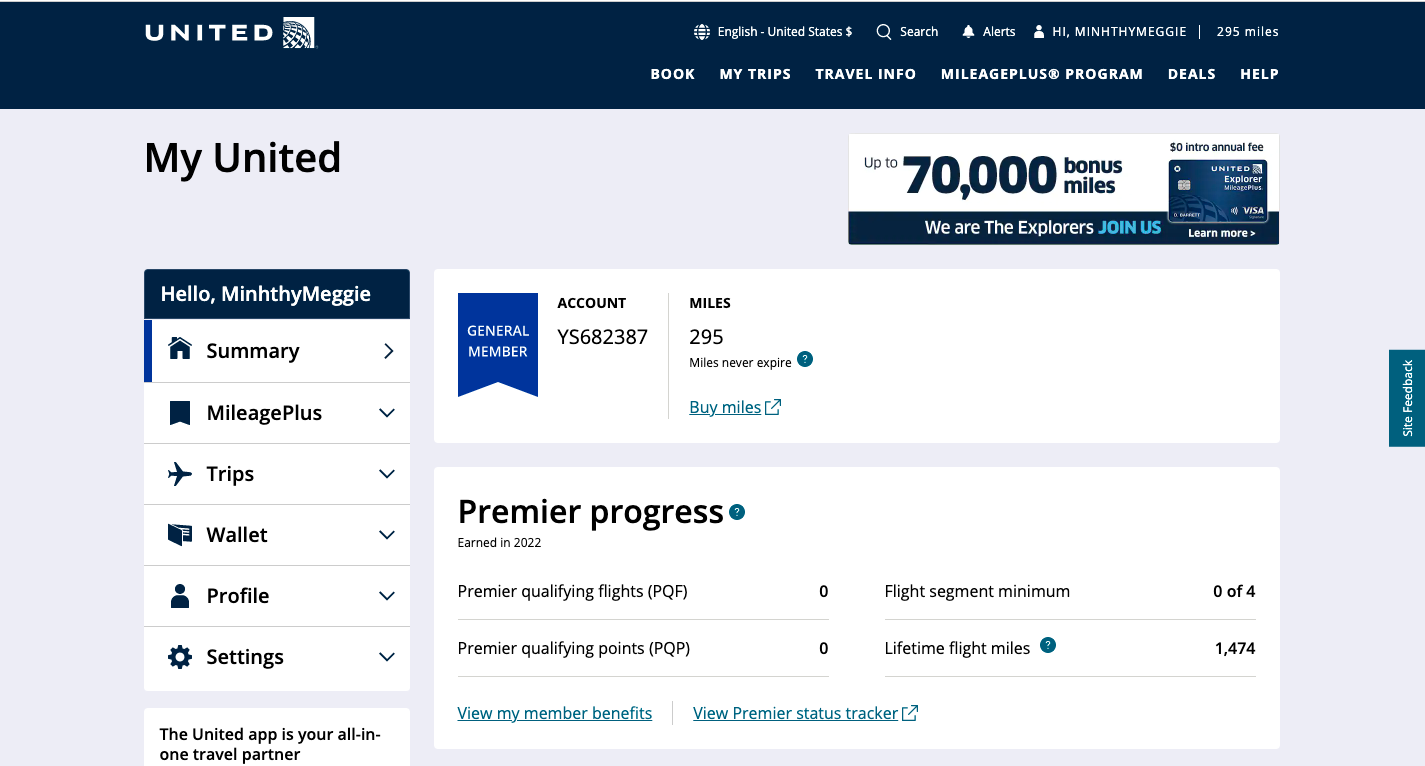
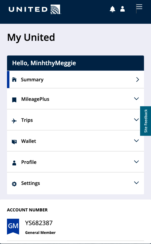
My United (account)
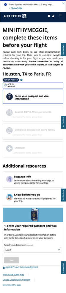
With My United, we found that users are clicking on ‘summary’ even though they were already on the summary page. This showed us that it wasn’t clear to the user what page they were on. For the mobile version, you can see that the menu stayed full length and stacked on top of the other sections. This was pushing all of the content below the fold.
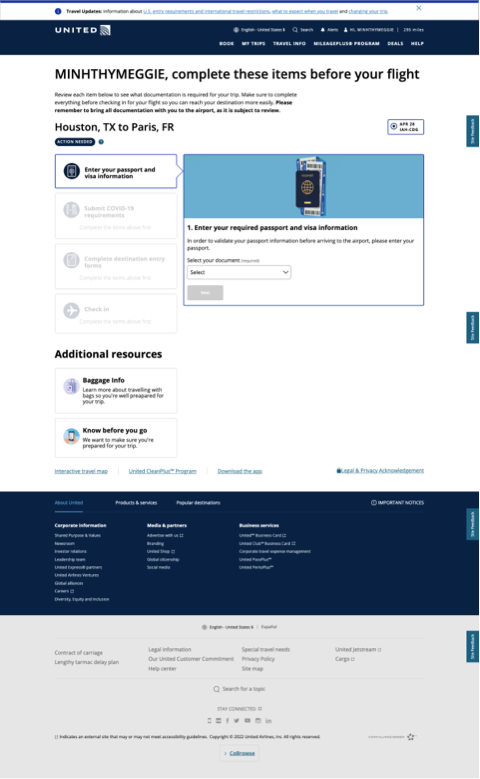
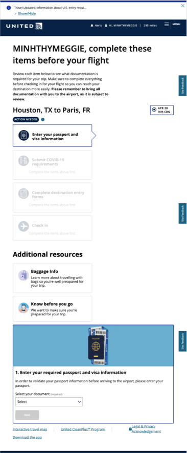
Travel-Ready Center
With the Travel-ready center, we found there was a lot of issues here. The left side navigation would populate the information on the right when in the full desktop version. However, when in tablet and in mobile, the navigation would take full width and the information on the ‘right’ side would be pushed all the way to the bottom. The connection here was very unclear and in the tablet version, the arrow pointing to the container on the right didn’t make sense as the container was pushed to the bottom. Within this component, the icons would adjust based on if you completed the task, so we needed to be able to make the navigation dynamic here.
IDEATE
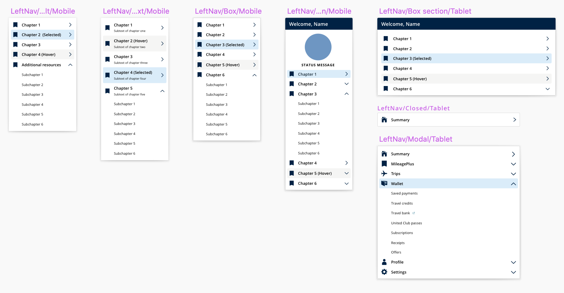
With the requirements in mind, I worked with the other UX designer on the design system team to ideate designs for this left side navigation. We wanted to solve the issue of the user not knowing what page they were on by making the selected state more noticeable. Below are a couple of the iterations that we had.
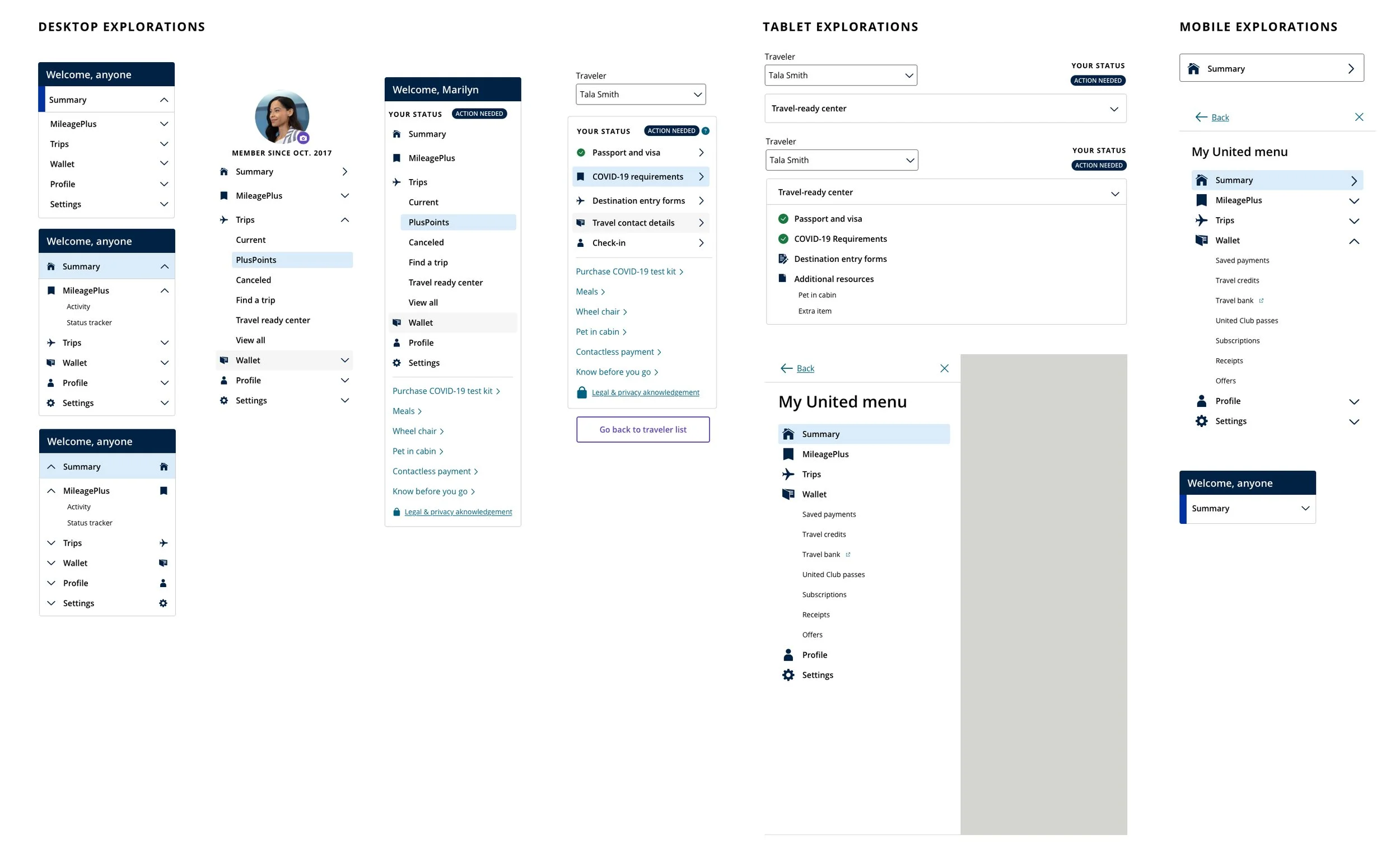
We found that the selected state with the full light blue background was the best indicator of the page that you were on. We also wanted a light grey hover state as well for users who needed to tab through the options so they knew which section they were on. For the tablet and mobile views, we wanted to be able to collapse the menu so that in a closed state, the content of the page would be higher up. Following these designs, we met with the leads again to discuss these designs and which worked with their products.
We finalized the designs based on the feedback but we still had some accessibility concerns with the tablet version. We wanted it to be able to be a drawer that pulled from the left side, but because the main navigation pulled from the right side, we weren’t sure if that was an accessibility issue.
NEXT STEPS
We are currently meeting with the accessibility team to discuss the designs and get approval from the team and then we will be working with our developers to get the component designed and updated in My United and the Travel-Ready center!