Check-in offers
giving travel agency bookers an incentive to come to united
Offering coupons targeted to our users who booked through a travel agency to incentivize them into booking on United channels for their next flight.
Tools: Sketch, Invision
Time frame: ~12 weeks
Background: United Airlines Personalization Project
Roles: UX design
THE CHALLENGE
How might we bring in the users who are booking with travel agencies to book with United in the future?
RESEARCH AND DEFINE
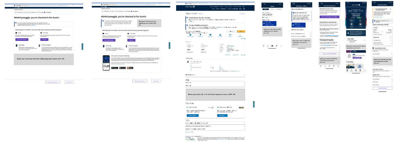
I worked with the business analysts to see how users were interacting with United when they booked their flight through a travel agency such as Expedia, Priceline, etc. We found there were three main reasons why users needed to go to United channels:
Checking in
Users needed to check in either on United.com or through the mobile app 24 hours before their flight regardless of where they booked it. However, some users would forgo doing it on digital channels and would do it physically at the airport kiosks.
Personal device entertainment
Another reason why users who booked on travel agencies were using the app was for watching movies and tv shows on the flight. This was accessible through using the browser or the app. Users were also playing Sudoku through the United app as well.
Managing their reservation
If users booked through an agency and wanted to make any updates to their trip, they would need to enter in their confirmation number on United channels.
IDEATE
I then explored in low fidelity the different concepts of how we could present the coupon to our users at these entry points so that they were more likely to see it and redeem it on their next flight.
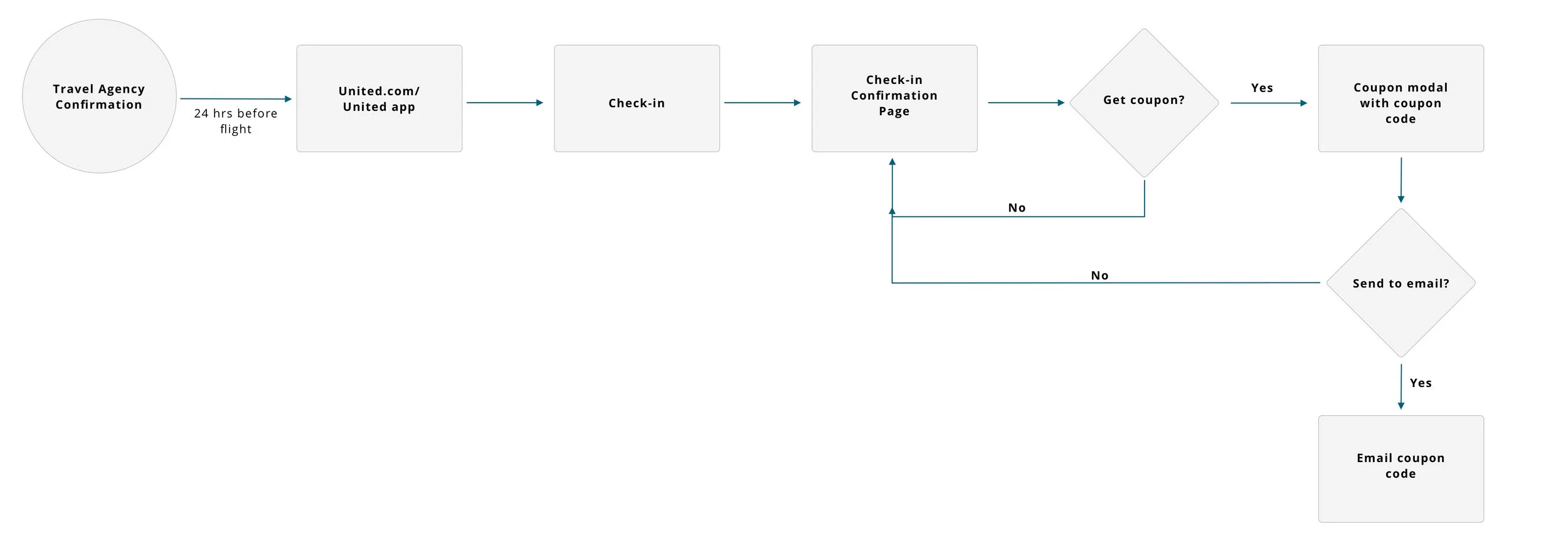
Because about 80% of our users were utilizing the United app and United.com for check-in, I recommended that we focus on this path forward to target these customers with coupons that they are able to use only on United channels. After discussing with the business team and developers, we all agreed that the check-in would be the most beneficial location and possible to get rolled out in the next 60 days. I created a user flow for our MVP flow where we were only targeting users who booked on a travel agency and did not need to sign up for a MileagPlus account to get the coupon code.
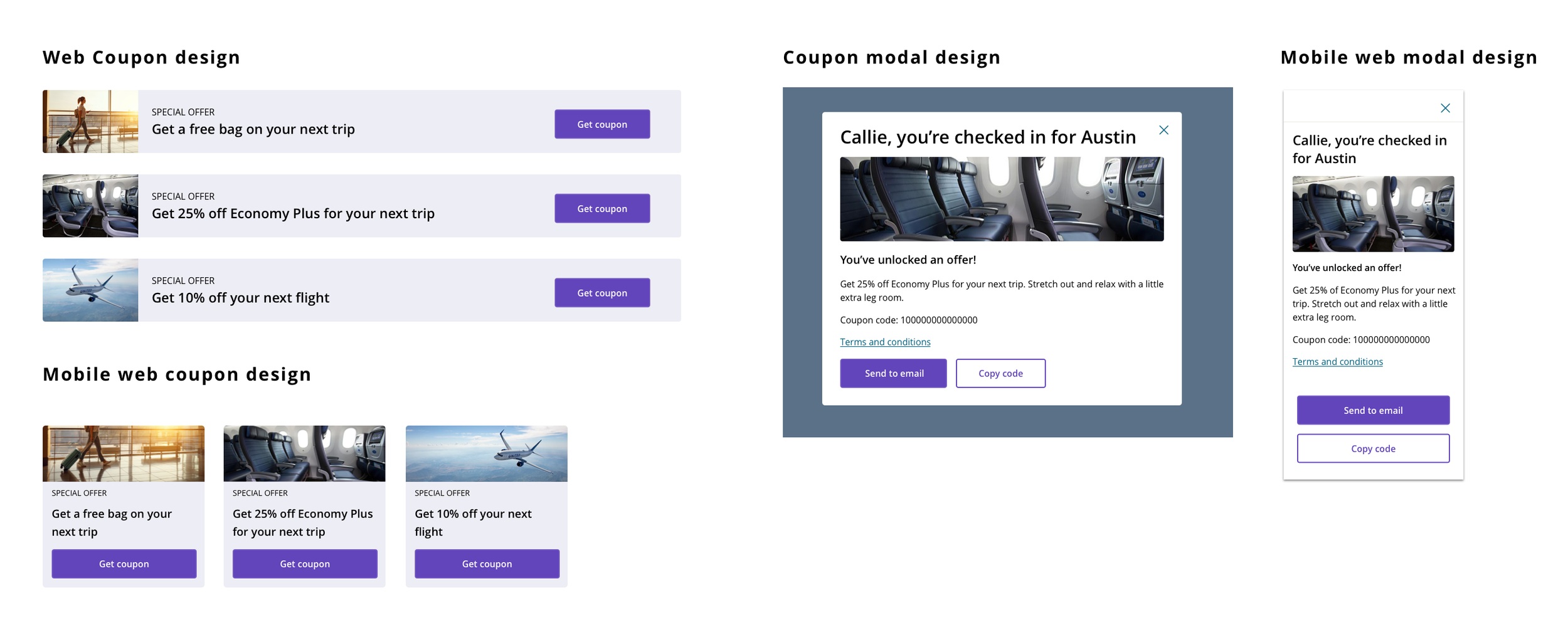
For the future phase, we are going to be requiring users to sign up to get their coupon code so that we are able to drive account creation. So I needed to be able to create a design with that in mind as well. I wanted to use our dusk color for the coupon offer because for ‘My offers’ in the mobile app, we were utilizing a dusk container for the coupons so I wanted users to see the dusk and think ‘coupon’. Below are the assets that I designed and the happy path user flow mocked up in high fidelity.
REFLECTION & NEXT STEPS
For next steps, I have currently designed a more elaborate flow of requiring the users to sign up for a MilagePlus account in order to get the coupon code. This was a business decision that was made in order to increase account sign ups. We wanted the user to be able to sign up in the easiest way possible so we are working towards including a 1-click enrollment for this process.
I was also the lead UX designer who had enabled the coupon addition in the shopping flow and together with targeting coupons in our social channels, emails and to travel agency bookers, we have generated over 1 million in margins so far. It has only been increasing since then and I hope to see an increase in our members once we go on to phase 2.


