Recommended destinations
Utilizing machine learning to provide recommended destinations that are generated just for you.
Background: United Airlines Personalization Project
Roles: UX research, UX design
Tools: Sketch, Invision, Usertesting.com
Time frame: ~12 weeks and counting
THE CHALLENGE
How might we utilize machine learning to inspire our users to travel and shop with United?
RESEARCH AND DEFINE
Test and Learn
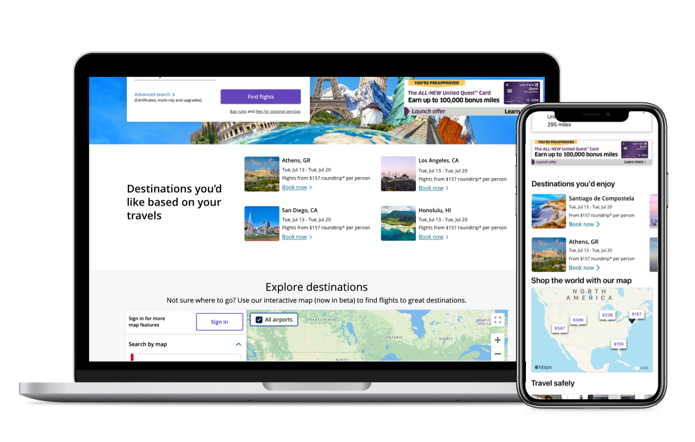
Before I began this project, United had previously done a test and learn with a feature to inspire travel by providing users with suggested destinations. However in this test, the destinations being generated were generic so every user was seeing the same destinations. The results didn’t show any significant improvement in conversions and so the project was put on hold for a while. After a couple of years, we were able to bring the project back but with the enhancement of utilizing our contextual engine to provide recommended destinations that were generated from the users past travel and shopping history.
Workshop
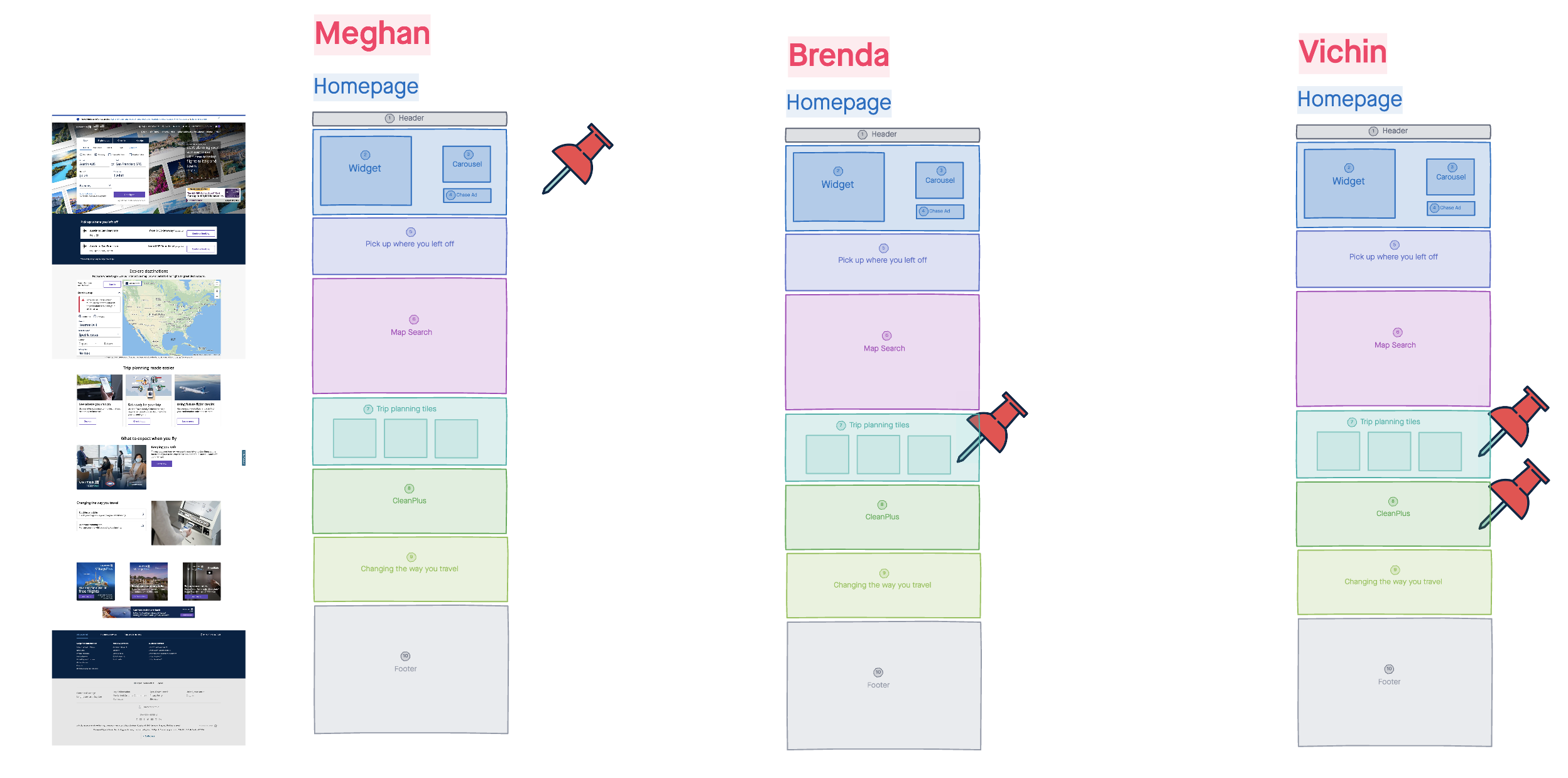
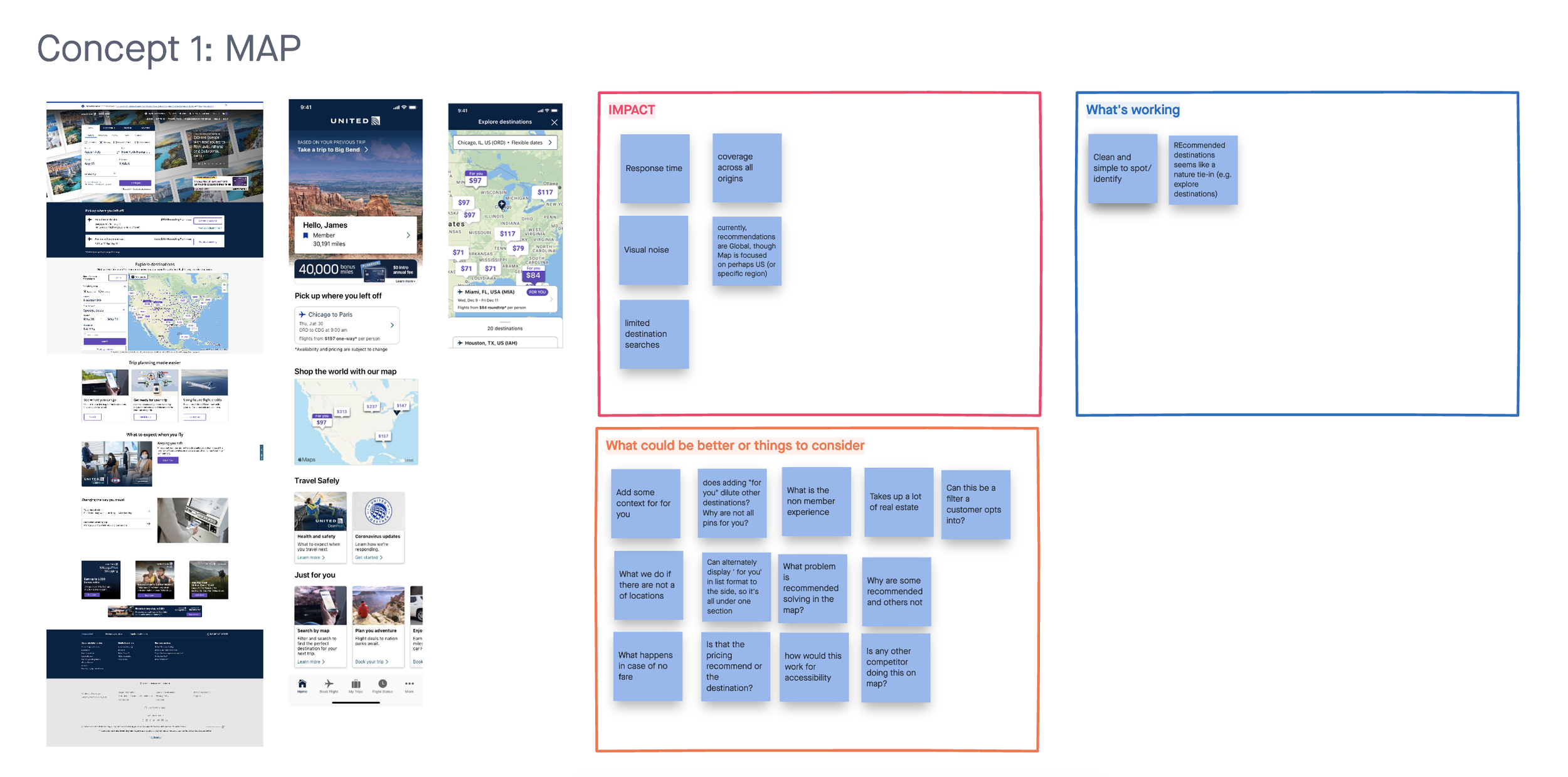
We held an hour long workshop with the stakeholders involved and did a ‘pin the tail’ activity on where each believed that recommended destinations would live on the homepage of the website. From those suggestions, I was then able to mock up a few ideas and discuss with the team the impact of each placement, what was working, and other things that we needed to consider.
IDEATE & DESIGN
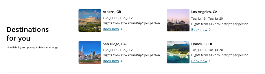
From the conversations that we had with the business team and development team, we decided that the best placement was to have the recommended destinations be in their own section and be directly on the page. We’d be able to test different placements in the future to see where we would see the most conversions.
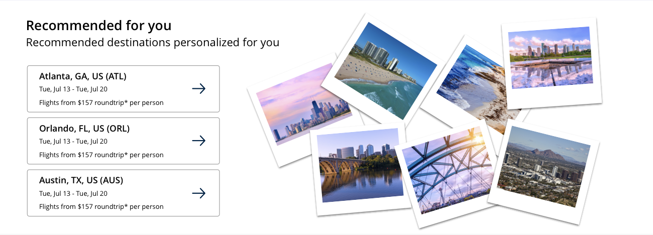
Now that we had the placements, it was then time to work on the design. In the beginning, the team wasn’t sure if we’d be able to show the destination image for each location so I had to create a version that utilized more generic images. Once it was decided that we were capable of using imagery for each card, I then worked on a few different ideas.

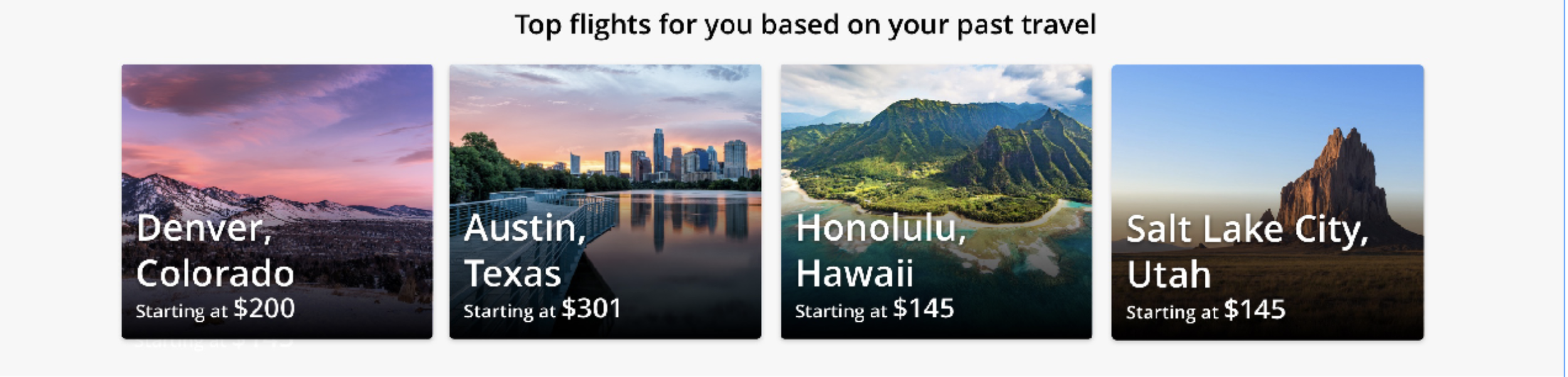
I wanted the cards to not feel like they were just ads. Because each card would be generated for the best prices and dates, I wanted to include an image but not make the image too large. Everything on the mobile app home page had an outline around it, so we wanted to be able to create a component that wasn’t in a container and that’s how we finalized the design below!
NEXT STEPS
This feature is currently live in production and throttling at 10% of our user base so that we are able to test and gather data to see how it measures. We are testing the click rates as well as conversion rates. It’s going to be a long test as we are not only just testing conversion from the placement within that day but also within the month. For example, if a user clicks on one of the placements and searches a flight, this flight would then be part of their ‘pick up where you left off’, if the user ends up purchasing a few days or weeks later, then it’s considered a success. This was a fun project especially learning about the models that we were using to provide the recommended destinations. I’m hoping to see a positive impact this feature has made so that we can iterate and enhance travel inspiration in the future.